Always use a label
Labels are often removed from form fields to save space and create a minimal aesthetic. However, minimal doesn’t always mean simple. Labels, in fact, are essential to the user experience because:
- sighted users can see the instructions.
- visually-impaired users can hear the instructions when using a screen reader.
- motor-impaired users can easily move focus to the field due to the larger hit area. (Clicking a label moves focus to the field).
Let’s take a look at two examples whereby labels are ditched at the expense of users.
An add to basket form
Sometimes the first option in a select box is used as a makeshift label. See the ASOS add to basket form for an example:
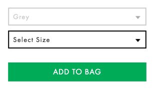
- This is probably enough for sighted users when an option hasn’t been selected. But, when an option has been selected, it’s hard to understand as is the case with the colour menu shown above.
- Motor-impaired users will find it harder to select the field due to the smaller hit area.
- Screen reader users will struggle to understand what’s going on because the options are a mix of instructions and options to pick.
A search form
Single-field forms often rely on placeholder text to provide instructions. You can see the Selfridges search form as an example of this here:
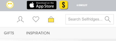
- Sighted users may be able to manage with this but really placeholders are problematic for many reasons.
- Motor-impaired users will find it harder to select the field.
- Screen reader users will find it difficult because placeholder text isn’t announced.
- If a foreigner wants to translate the page using the browser’s translation routine, the placeholder is ignored.
Summary
Trying to declutter an interface to reduce noise is a noble goal. But labels aren’t noise. Removing labels to save space causes unnecessary usability problems.
Accomodating a visual label may require extra thought, but that’s our job as designers to make sure the things we make work for everyone.