Why toggle switches suck (and what to do instead)
A couple of weeks ago I appeared as a guest on the Complimentary podcast hosted by Katie Langerman and Anthony Hobday.
One of the topics that we talked about was the idea of using toggle switches (over radio buttons and checkboxes).
Like I said in the podcast there are definitely some bad reasons to use a toggle switch (they’re cool, different, fun). The so-called good reason to use one being that you need the action to take immediate effect.
But my problem is that this describes the outcome. It doesn’t explain why a particular action needs to take immediate effect in the first place.
I can think of 3 reasons:
- It’s quicker
- It avoids a page refresh
- It avoids the risk of users forgetting to save their changes as a separate step
Put like that, you’d be mad NOT to use a toggle switch.
But that’s the opposite of my advice.
Here’s why:
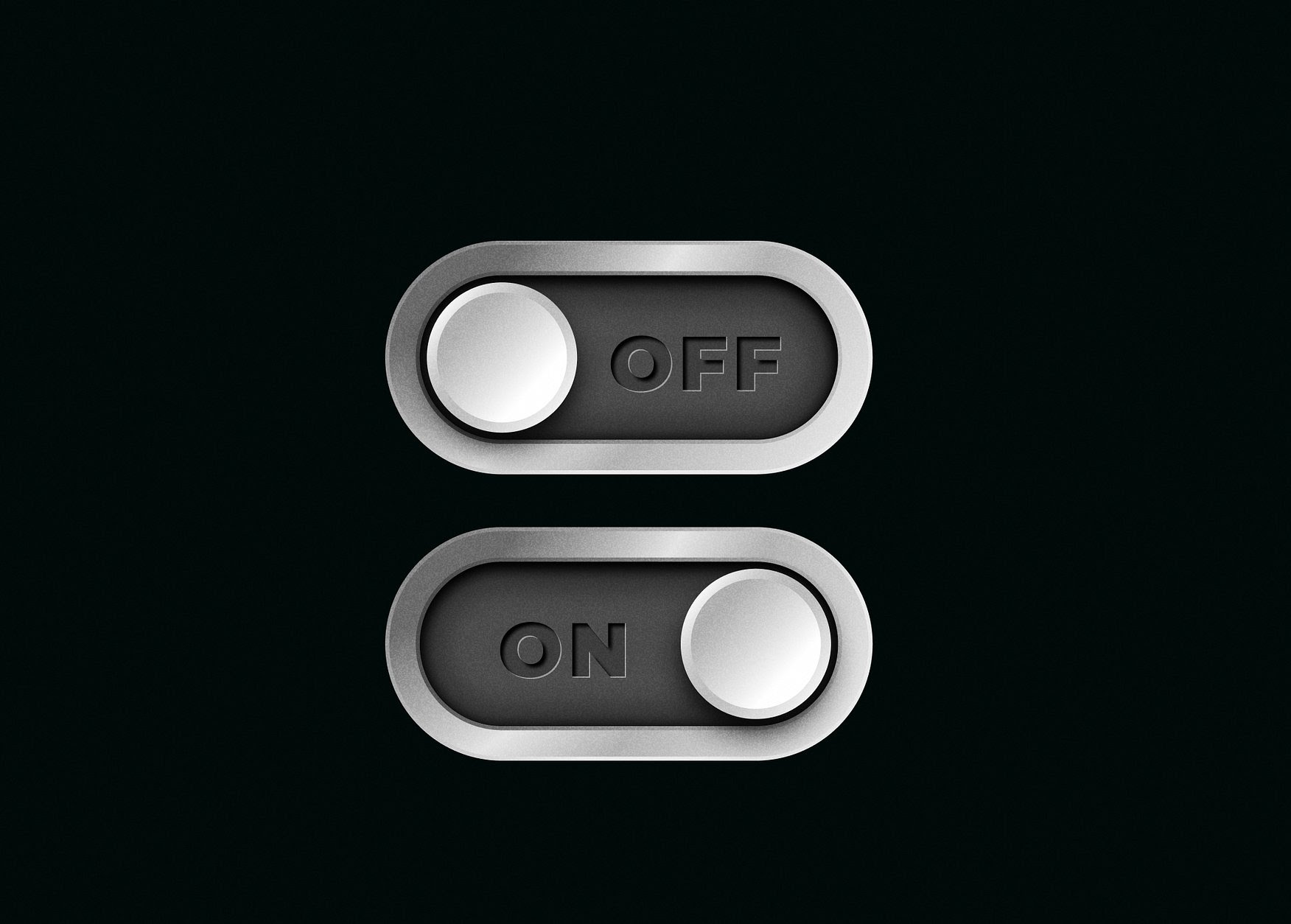
Reason #1: Users may not understand whether the toggle is on or off
Here’s a settings screen on my iPhone:
Notice how colour and alignment is used to indicate that the setting is on or off.
But if you’re colour blind or don’t know what the alignment means, you’re screwed.
Why make users think when you don’t have to?
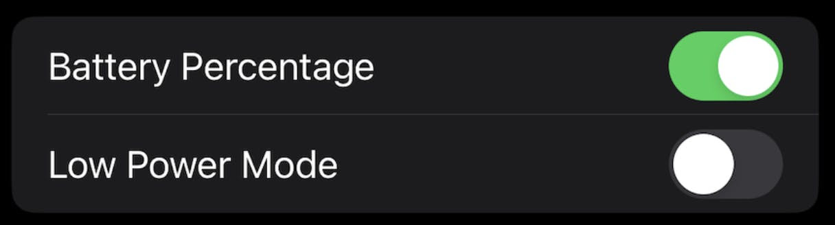
You could put text inside the button:

But some users may think that to turn it on they have to press the button or move the knob to the “on” position.
Finally, you could put the label on the outside like this:

That’s better but most toggle switches aren’t designed like this and there are plenty more downsides:
Reason #2: Users may not know how to use them
For example, some users try and swipe the toggle left or right when they’re meant to be clicked.
You might think this is a minor problem, but my approach is:
Avoid friction especially when it’s easy to do so using simple, conventional, accessible patterns (more on this later).
Reason #3: The setting may not be saved
Because toggle switches must take immediate effect, they have to use AJAX to prevent the page being refreshed.
But if the request is slow there’s a risk the system won’t save the change. This could be catastrophic or just annoying depending on the use case.
To handle this you need to handle error and loading states:
Either way this is bad given that the main reason to use a toggle switch is for it to take immediate effect.
Reason #4: They can cause inconsistency
Here you can see a settings screen on iOS:
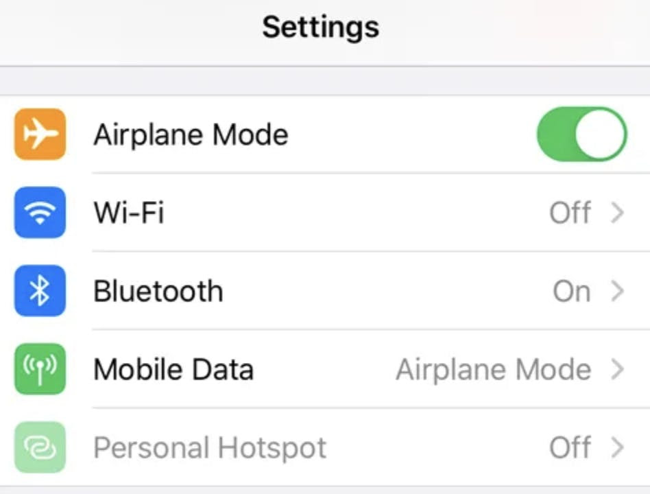
Some settings have 2 options (and use a toggle switch) and some have more than 2 options (and don’t). Notice how Airplane Mode is on and Wi-Fi is off.
But they have completely different interactions.
Now admittedly I’m usually the first one to challenge “it must be consistent” but if you can be consistent you should be consistent.
Reason #5: They need JavaScript to work
If you care about progressive enhancement (and you should) your UI needs to work when JavaScript is unavailable.
Which means you gotta start by using radio buttons, checkboxes or buttons anyway.
So start there and see how you get on (I predict very well).
“But toggle switches are faster to use than radio buttons!”
That may be true if you only measure the interaction from the point in which the user has decided to click.
But it’s not true if you measure the interaction from the point in which the user first comes across the setting.
Comprehension is part of the equation.
Also with radio buttons, users can batch their changes in one go which can be faster.
So again start with radio buttons and test. If your form is well designed you’ll find speed is not an issue.
“But what if you need to avoid a page refresh?”
The web is made up of web pages. When you load one, the page refreshes. It’s totally cool.
And usually when a designer tries to avoid a page refresh it creates all sorts of issues that degrade UX that didn’t exist in the first place.
But sometimes a page refresh can degrade UX. For example, let’s say you’re in a Zoom call and want to turn on your mic. Refreshing the page means leaving the Zoom call.
So here I’d just use a toggle button just like Zoom does:
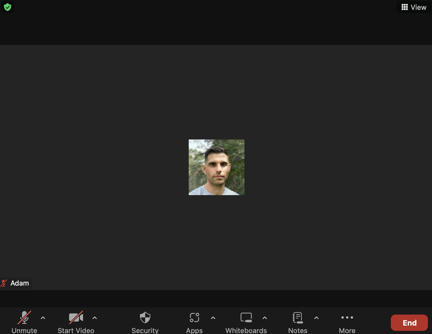
It also has the added benefit of a larger tap target and a clear label written as a verb to make it clear what will happen.
“But what if users forget to save their changes?”
I can’t diagnose this one without seeing your form (feel free to send me a screenshot).
But the answer is likely to be: keep your submit button close by.
If you’d like to learn how to design relentlessly simple and accessible forms without ever having to use a dodgy toggle switch, check out Form Design Mastery: