Designing a time input
In 2021 I worked on a service that allows teacher training providers to set up interviews with trainees.
As part of this, we wanted to find out the best way of allowing users to enter a time in the correct format.
This is more challenging than you might think because:
- a time is made up of hours, minutes and a period (AM or PM)
- there are many different formats for the same time like ‘12am’ ‘24:00’, 12.00am’, ‘12a.m.’ and ‘00’
We played around with all sorts of patterns like autocompletes and using multiple inputs for hours and minutes.
But after several rounds of research and data analysis we ended up with something much simpler.
To give you all the details I’m going to walk through:
- how to avoid the complexity of entering time in the first place
- the 4 different patterns we considered
- the 1 simple pattern that works the best and why
How to avoid making users enter a time
When it comes to forms, whenever we can help users avoid having to fill them out in the first place, we should.
When it comes to time there are certain ways to do that.
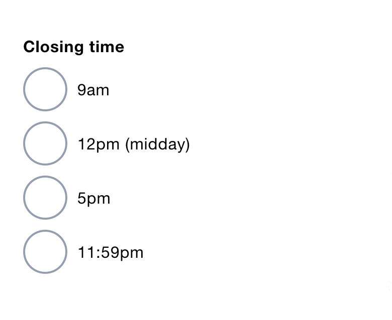
For example, I’m working on a service that has a closing time field for a job advert.
We could avoid making users enter a time by automatically setting the closing time to 11:59pm.
But as our users need greater control we provide 4 common times as radio buttons. Users just pick one and move on.
Different ways of entering a time
Different techniques can be used for time. They are:
- Native time input
- Multiple inputs
- Autocomplete
- Single input
By looking at the pros and cons of these, it’ll become clear why I recommend using a single text input.
1. Using the native time input (type="time")
As usual, the first approach to look at is what browsers give us for free - the native time input.
It works differently depending on the browser or device.
Chrome on desktop, for example, gives users a text input with slot for the hour and minute separated by a colon.
It also provides a clock icon, which when clicked reveals a menu to select the hour and minute.
This is problematic for a few reasons.
Firstly, once the hour has been selected, focus is moved automatically to the minute slot. If the user made a mistake, they have to move the focus back to the hour slot.
Due to the colon, it may not be clear that the focus can be moved back by pressing Left. I think a lot of users will opt to use their mouse. Either way it’s long winded.
Secondly, the colon cannot be selected even though it’s inside the box. This is misleading because normally the contents of an input can be selected.
Thirdly, it’s not clear that the clock icon reveals a menu or what that menu will consist of.
Finally, users cannot cut and paste a time into the input.
Chrome on Android gives users an empty text input with a little down arrow. When focused it reveals a dial.
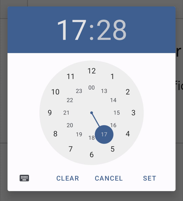
This is also problematic.
Firstly, before the user focuses the input, it looks a bit like a select box due to the down arrow. Opening a dial may be unexpected.
Secondly, the dial isn’t particulary intuitive and has action labels that cannot be customised.
Finally, sometimes hint text is needed - but that’s covered up by the dialog.
(Note: browsers that lack support for the native time input will get a standard text input.)
2. Using multiple inputs
The second approach involves using multiple inputs for:
- hour - as a text input or select box
- minute - as a text input or select box
- AM or PM - as a select box or radio buttons
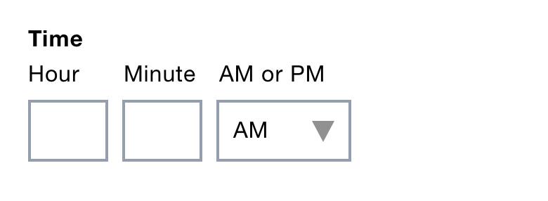
This avoids having to deal with different formats.
But select boxes should be used as a last resort. And multiple inputs are problematic because:
- they stop users from cutting and pasting
- they require more effort to use
- they can be difficult to label (‘AM or PM’ is a bit awkward here)
(Note: the input for ‘AM and PM’ is needed because otherwise some users incorrectly enter ‘12’ or ‘00’ for midnight.)
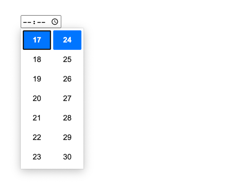
3. Using an autocomplete
The third approach is to use an autocomplete input. This is like a text input and a select box combined.
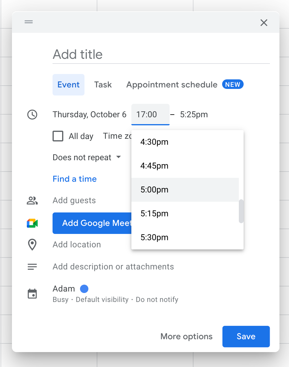
Clicking the input reveals a list of times - typically at 30 minute intervals.
Users can select a time or type to narrow down the suggestions.
The problem with this approach is that:
- users are less aware of how to operate an autocomplete
- users may enter a time in 24 hour format with the options shown in a 12 hour format (see above screenshot)
- making an accessible autocomplete is hard
- autocompletes rely on JavaScript which means a non-JavaScript solution needs to be considered before enhancement
4. Using a single text input (recommended)
The final approach - which I recommend - uses a single text input for time.
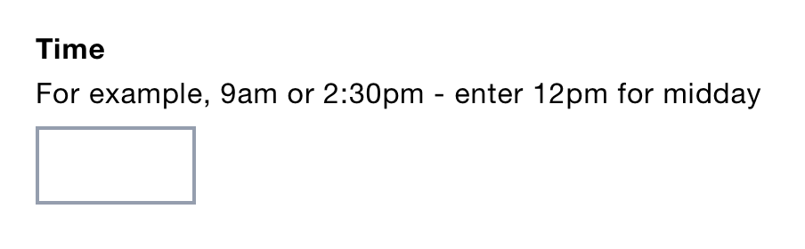
It works well. It’s consistent across all browsers and devices. Users just type what they like.
My research shows that using a single input works very well as long as you accept a wide range of formats.
The only argument against this approach is the effort required to accept all these formats.
But I don’t count this as a problem because:
- it’s doing the hard work to make it simple
- it’s far easier to build than an autocomplete
- we have to do this anyway when considering progressive enhancement
- it’s not that much effort to build (we used Timeliness with minimal configuration)
I also want to highlight that even:
- if research showed that an autocomplete works better we’d still need to use a single input when JavaScript is unavailable
- if research showed that the native time input works best, we’d still need to use a single input for browsers that lack support
So we may as well start with a single input and prove through research that it’s worth the extra effort of doing anything more.