The problem with float labels and what to do instead
Float labels are labels that start off inside the input. When the user starts typing, the label ‘floats’ up to make space for the answer.
Float labels were designed to address the problem with using placeholder labels – that the label disappears as soon as the user starts typing.
And while they’re certainly better than placeholder labels, they create several usability issues.
Here, I’ll run through them all and I’ll explain what to do instead.
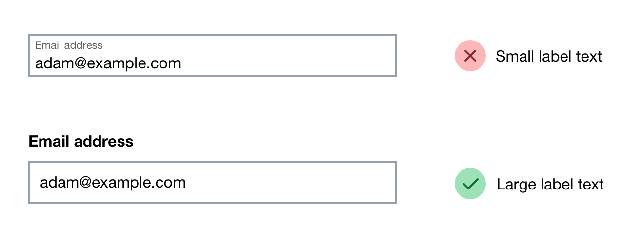
1. They’re small and hard to read
Float labels have small text in order to make it fit inside the input. But that makes them hard to read.
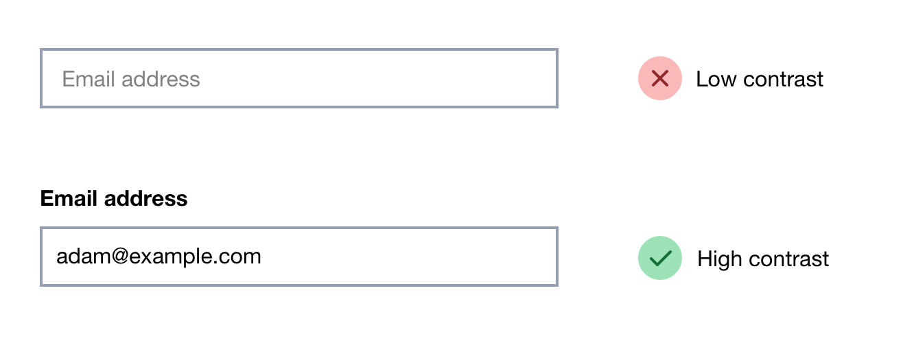
2. They have poor contrast
Float labels have poor contrast in order to distinguish itself from an actual answer. But this also makes them hard to read.
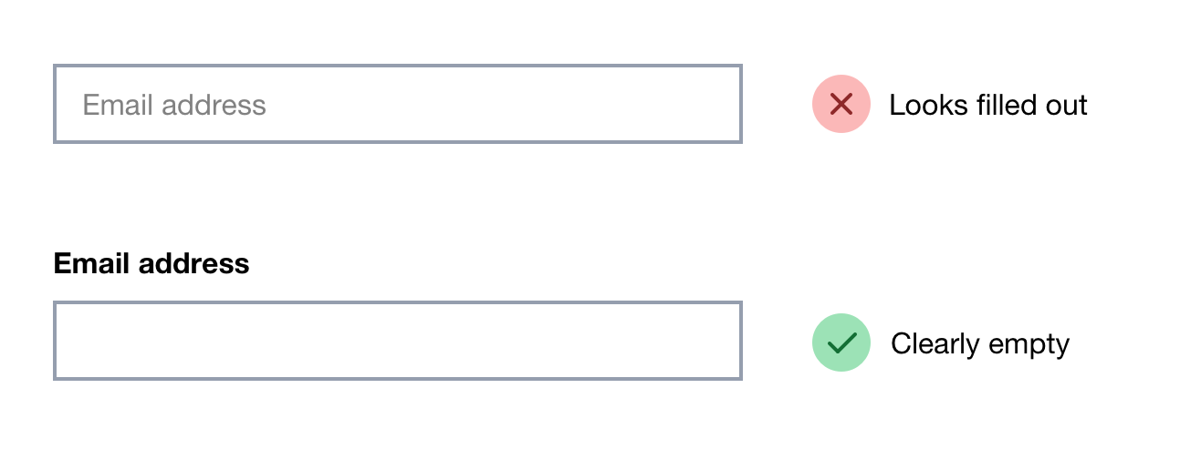
3. They may be mistaken for an actual answer
Like placeholder labels, float labels may cause users to think the field has already been completed.
This often leads to users seeing validation errors when the user later goes to submit the form.
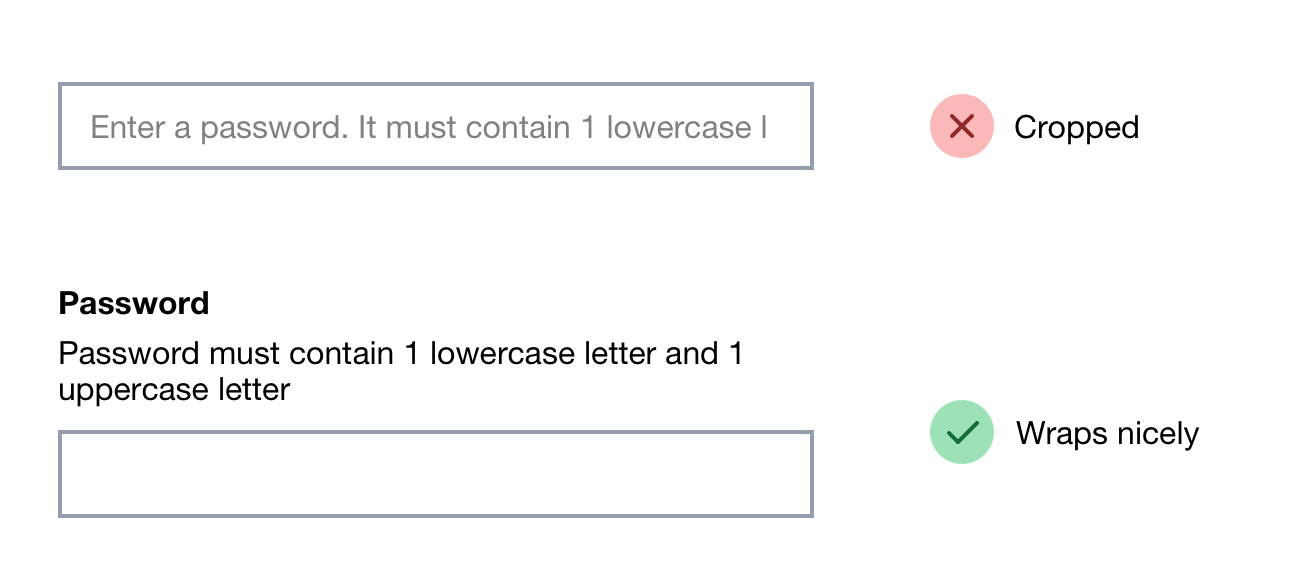
4. A long float label will be cut off by the input
Long float label text will get cut off by the input which makes the question difficult to understand.
5. Animation can cause problems for some people
Float labels animate into position which can be disorientating and problematic for users who are sensitive to motion.
When zoomed in, the label may disappear off screen as Geri Reid explains:
“I saw first hand what a headache [float labels] can be for a person using a zoom tool as the label can disappear off-screen as it floats up. And the testers who work at DAC are expert users […]”
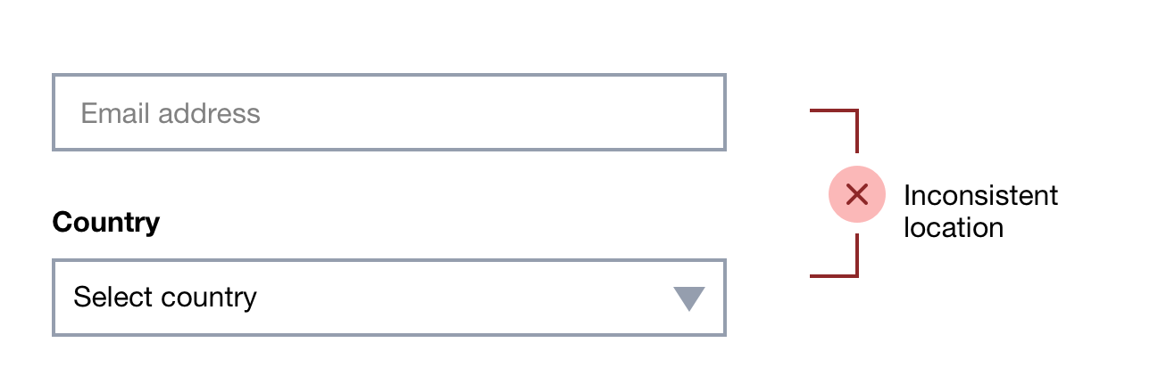
6. They’re inconsistently located
The float label function only really applies to a text input. They cannot really be applied to checkboxes, radio buttons and select boxes. This can make the label harder to scan across different types of fields.
7. They don’t make room for hint text inside the input
With float labels there’s no space inside the input for hint text.
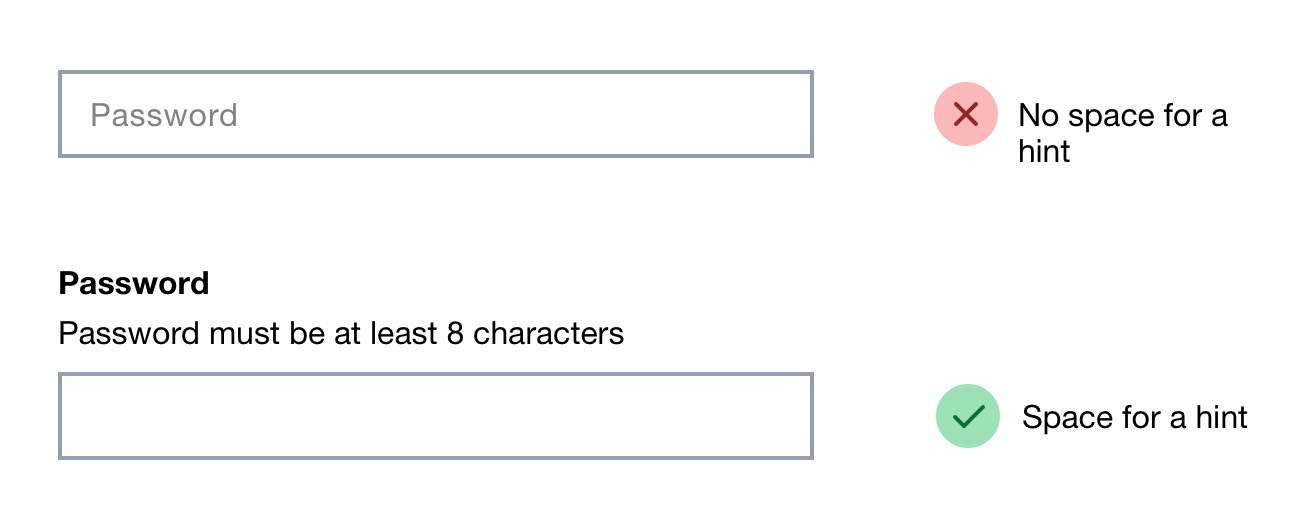
Hint text could be placed underneath the text box but this means that:
- it can be obscured off by the browser’s autocomplete dialog or on-screen keyboard
- it’s further disconnected from the label that it’s meant to be elaborating on
8. Any error message has to go under the input which isn’t ideal
Any error message has to go under the input as there’s no other place for it to go.
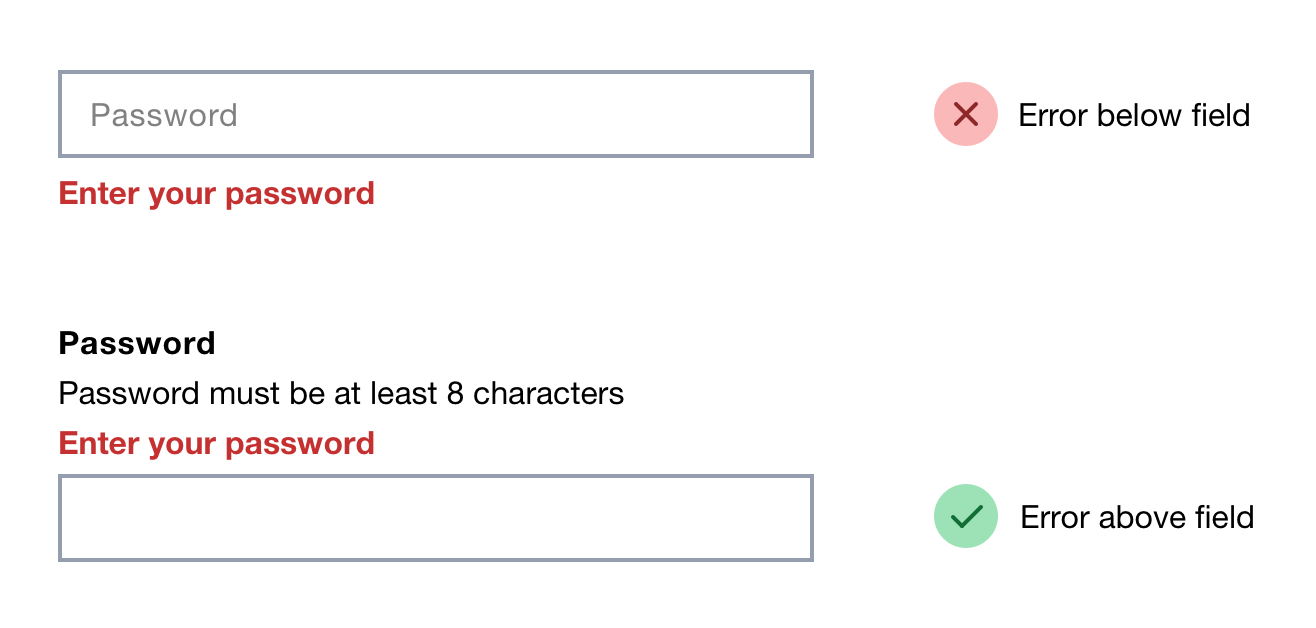
But like the hint text issue above, putting the error under the input means the autocomplete dialog or on-screen keyboard can obscure them from users.
Float labels don’t actually save space
Float labels need a place to move to.
Therefore, if float labels were given a legible font size, they wouldn’t really save space at all.
Maybe you could make space as the label animates into position, but that would make the page jump awkwardly as the user starts typing.
Just use a static label above the input
This means:
- the label can be read
- it’s obvious where the answer goes
- it’s obvious which fields need to be completed
- the label can be as long as it needs to be