Form design: multiple inputs versus one input
There’s been some comments about this on Twitter.
While most fields are made up of just one input, like an email address, some fields (that are essentially one value) could be split into multiple inputs, like a sort code.
This is done to help users read back their answer more easily, in small chunks, or to help users meet the formatting requirements of something like a reference number.
While using multiple inputs can be helpful, most of the time it’s completely unnecessary and it has a number of drawbacks.
Here, I’ll explain why that is and I’ll show you how to help users check their answers and meet formatting requirements without using multiple inputs.
And I’ll provide guidance about when it’s actually beneficial to use multiple inputs.
The problem with multiple inputs
1. They stop users from pasting easily
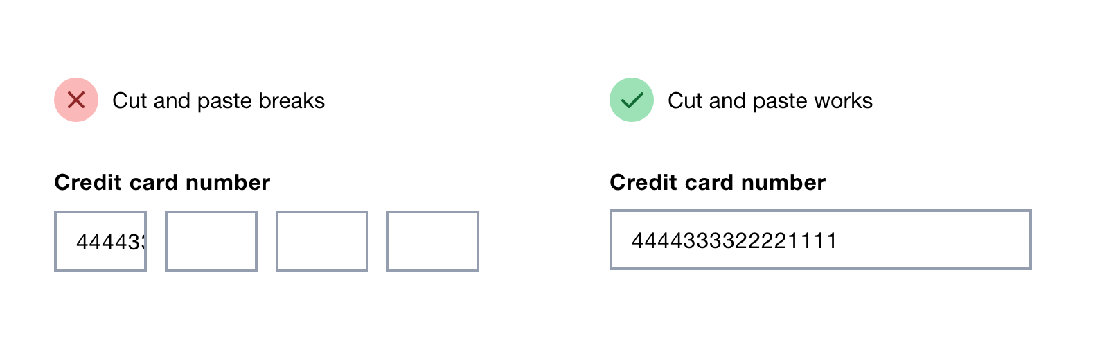
Using multiple inputs stops users from being able to paste values easily.
JavaScript can be used to let users paste a value across multiple inputs.
However, multiple-input fields are not always implemented in this way – even if they were, users may not realise that they’re able to do this.
2. They require more effort to use
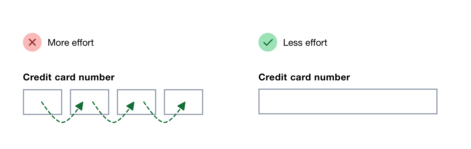
It takes effort to move from input to input. Remembering where you are and fixing mistakes also increases cognitive load.
Screen reader announcements are more frequent and verbose, because the group label is announced in combination with the individual input label.
Some sites use JavaScript to automatically move focus to the next input once the previous input is complete. But even though this seems like a good way to save users from moving focus manually it’s really troublesome.
Firstly, it can be disorientating because this is not how focus works by default. Normally, focus remains on the input until the user decides to move on.
Secondly, a lot of the time focus moves too early. What is technically complete – say the first 2 numbers of a sort code – may not be complete from the user’s point of view.
For example, if they typed the wrong number by accident, they‘d have to move back to the input manually – something that automatic focus was trying to avoid.
If you make it one input then all these problems go away because they can type freely or move back without focus moving and losing context.
3. They can be difficult to label meaningfully
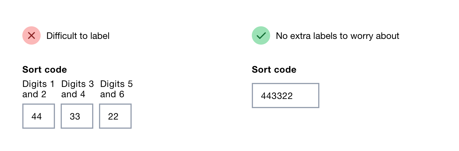
Writing labels for each input can be challenging.
For example, the individual inputs of a sort code would be something like ‘Digits 1 and 2’. This isn’t particularly useful.
And there’s not enough room for these labels because fields that consist of multiple inputs tend to be small, to reflect the required length, and close together, to show they relate to each other.
You could visually hide the labels but this only solves the problem for sighted users – it still creates unnecessary noise for screen reader users.
If it’s a struggle to write a meaningful label, it should probably be one field anyway.
Bad reasons to use multiple inputs and what to do instead
There are 2 usability issues which can be solved by using multiple inputs for one field. However, you can get around these issues in other ways.
1. To help users avoid error
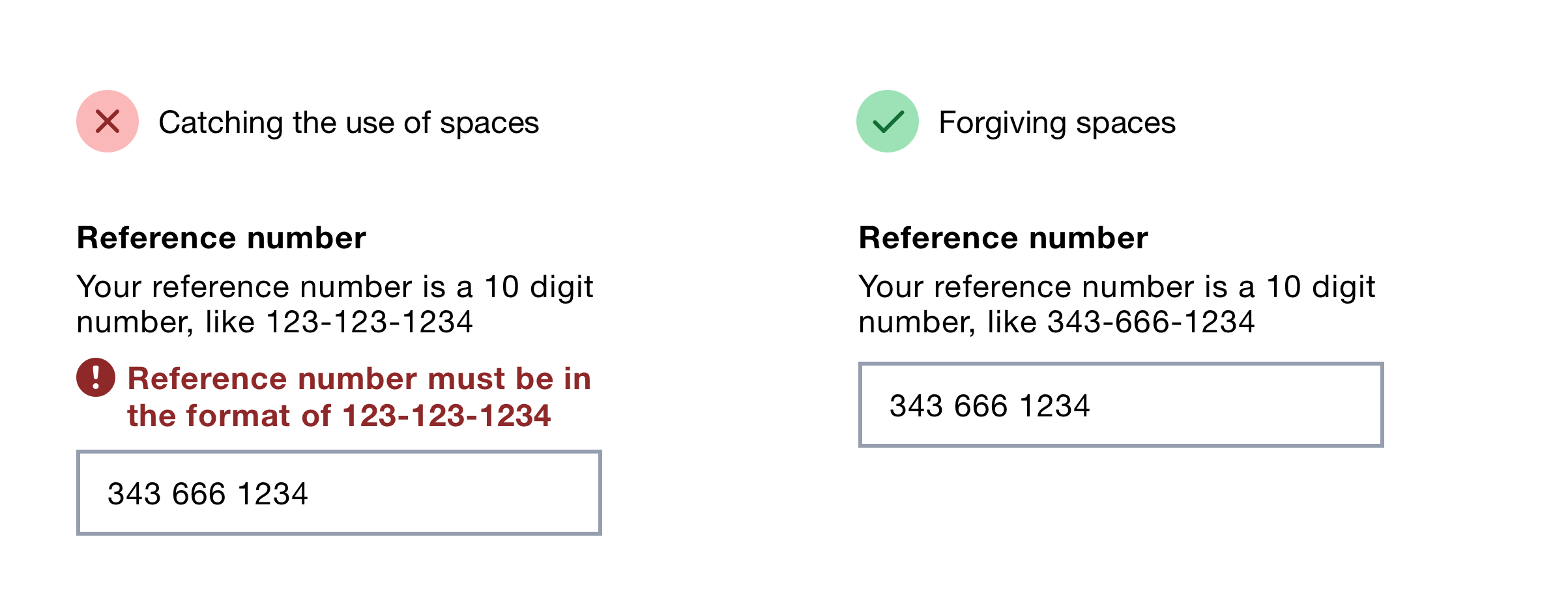
Multiple inputs are used is to help users avoid error.
For example, imagine the user needs to type a reference number that is 10 digits long, in a 3-3-4 format, separated by dashes.
Using multiple inputs encourages the user to leave out unnecessary formatting such as spaces or dashes. This reduces the likelihood of error messages coming up, such as ‘Reference number must be in the format of 123-123-1234’.
But it’s better to forgive these sorts of mistakes by ignoring extra spaces or dashes, which lets users enter the value however they like.
2. To help users check their answers
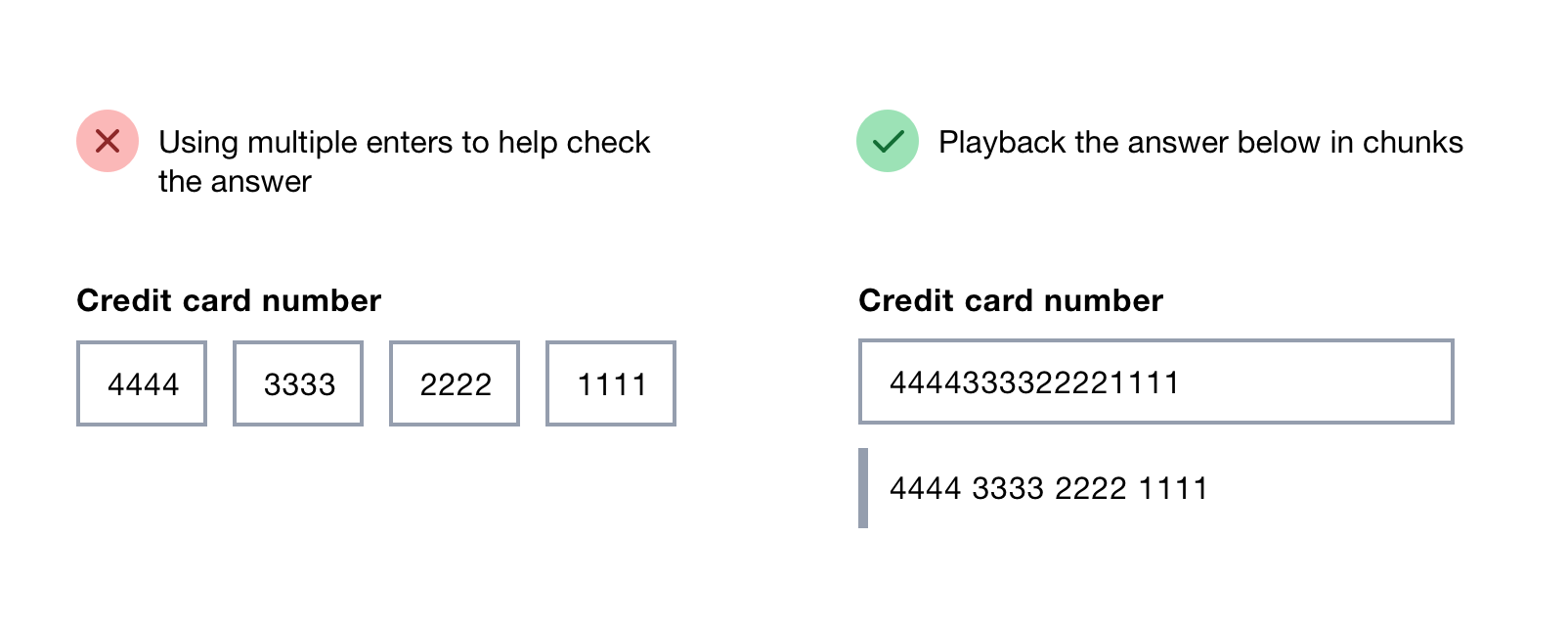
The other common reason to use multiple inputs is to help users read back the information they inputted to check it’s correct.
But you can help users with this without using multiple inputs by playing back the answer in chunks either underneath the field or on a check answers page.
Input masks are problematic
Input masks are meant to help users avoid mistakes and check their answers.
They work by automatically placing characters into the input as the user types, like placing a dash after the user types the first 3 numbers of a reference number.
But I don’t recommend them because they may confuse users as a new character appears (visually or audibly in a screen reader) and they restrict users to a particular format.
Forms expert Caroline Jarrett has also seen users struggle to work out why the information they typed changed when they thought that what they typed was an appropriate answer.
When to use multiple inputs
Even though multiple inputs should be used as a last resort, that doesn’t mean they should never be used.
Multiple inputs should be used if one input causes users to struggle to answer the question or means it’s impossible to validate the answer.
Dates are a good example of this. The way a user writes dates depends on where they come from – 10/9/12 could mean 10 September or 9 October (assuming the year always comes last).
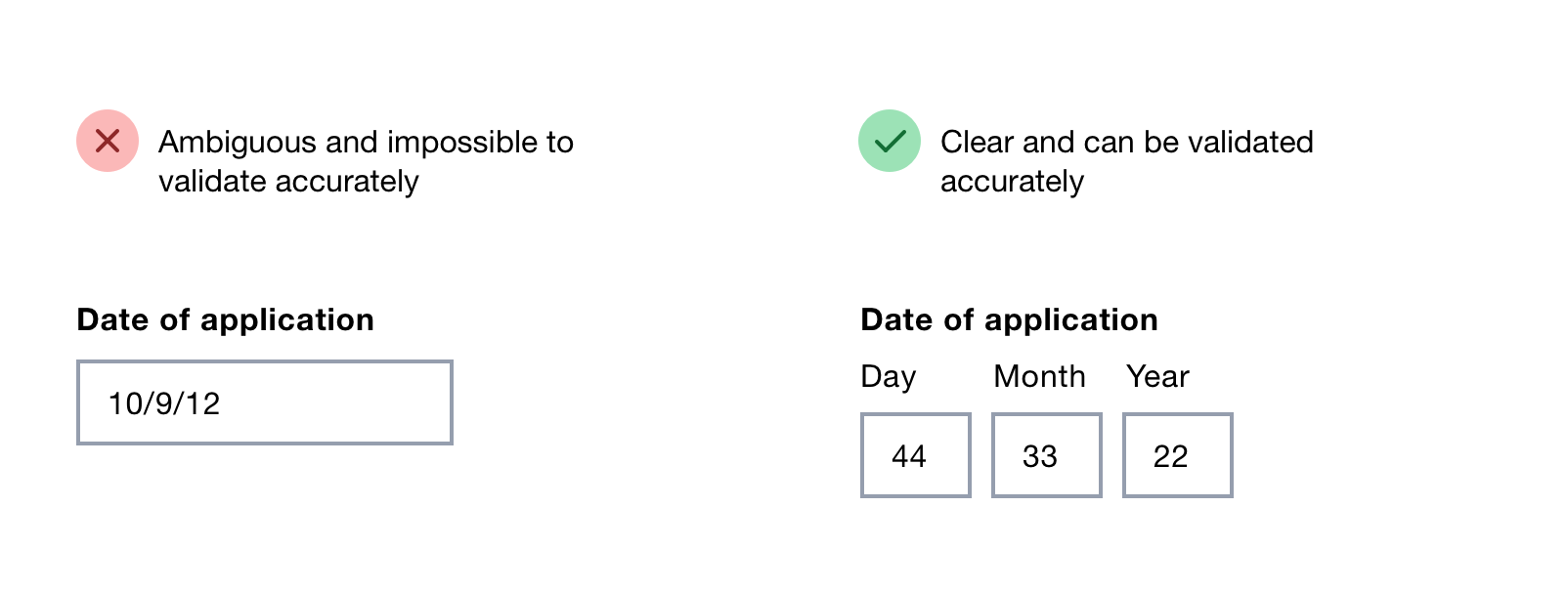
Using separate inputs removes ambiguity both to the user and the server doing the checking.
Summary
While using multiple inputs for one field may be necessary at times, doing so has a number of downsides.
If you need to play back the answer in chunks, do it underneath the field or separately on a check answers page.
Multiple inputs are usually completely unnecessary anyway. It’s better to give control to users and forgive simple formatting mistakes.
Thanks to Emma Frith for editing this.