Designing the child funeral fund service
Background
In March 2019, the then Prime Minister announced a new scheme to help with funeral costs for parents who have lost their child.
Under the scheme, parents will be able to get financial support to cover the costs of burials or cremations.
Tight deadlines meant that the team and I had just 6 weeks to design and launch the service to the public.
While the service also applies to funeral directors and cremation and burial providers, this blog post focuses on the journey for parents and friends of the family (also known as the responsible person).
Making tradeoffs
With our deadline, we didn’t have time to do research directly with users or go through a service assessment.
Here are the tools we used to help us design a simple service as fast as possible.
1. The MOJ Form Builder platform
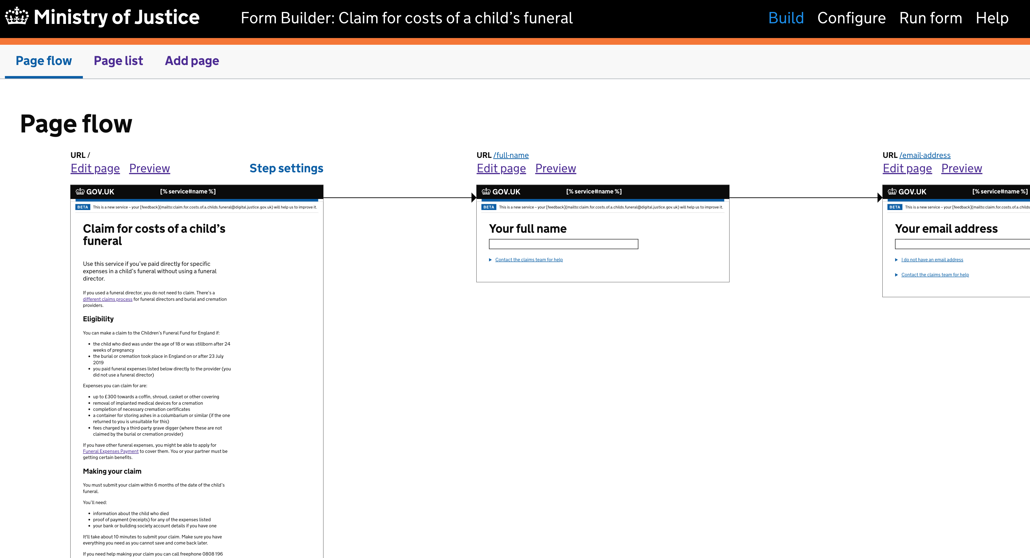
Ministry of Justice (MOJ) Digital and Technology created the Form Builder platform to let publishers create digital forms easily using components from the GOV.UK Design System.
Using the platform for this service significantly reduced the time it took to develop and launch our service.
2. Desk research
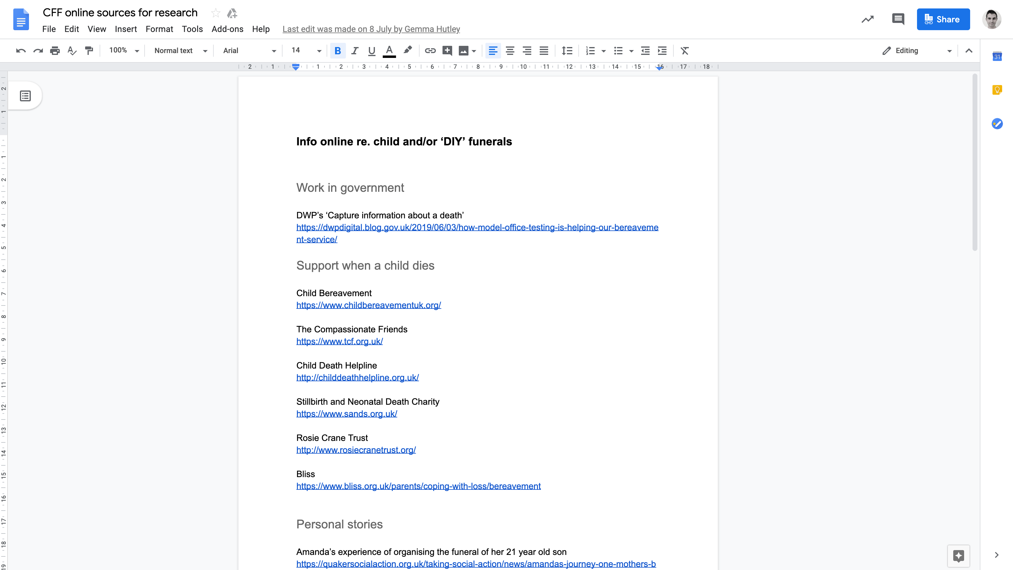
The team shared links to articles, content on funeral director sites and existing content on GOV.UK.
Our user researcher also contacted bereavement charities and spoke to the Funeral Expenses Payment team at the Department for Work and Pensions to learn how best to communicate with those who have suffered bereavement.
3. Journey mapping
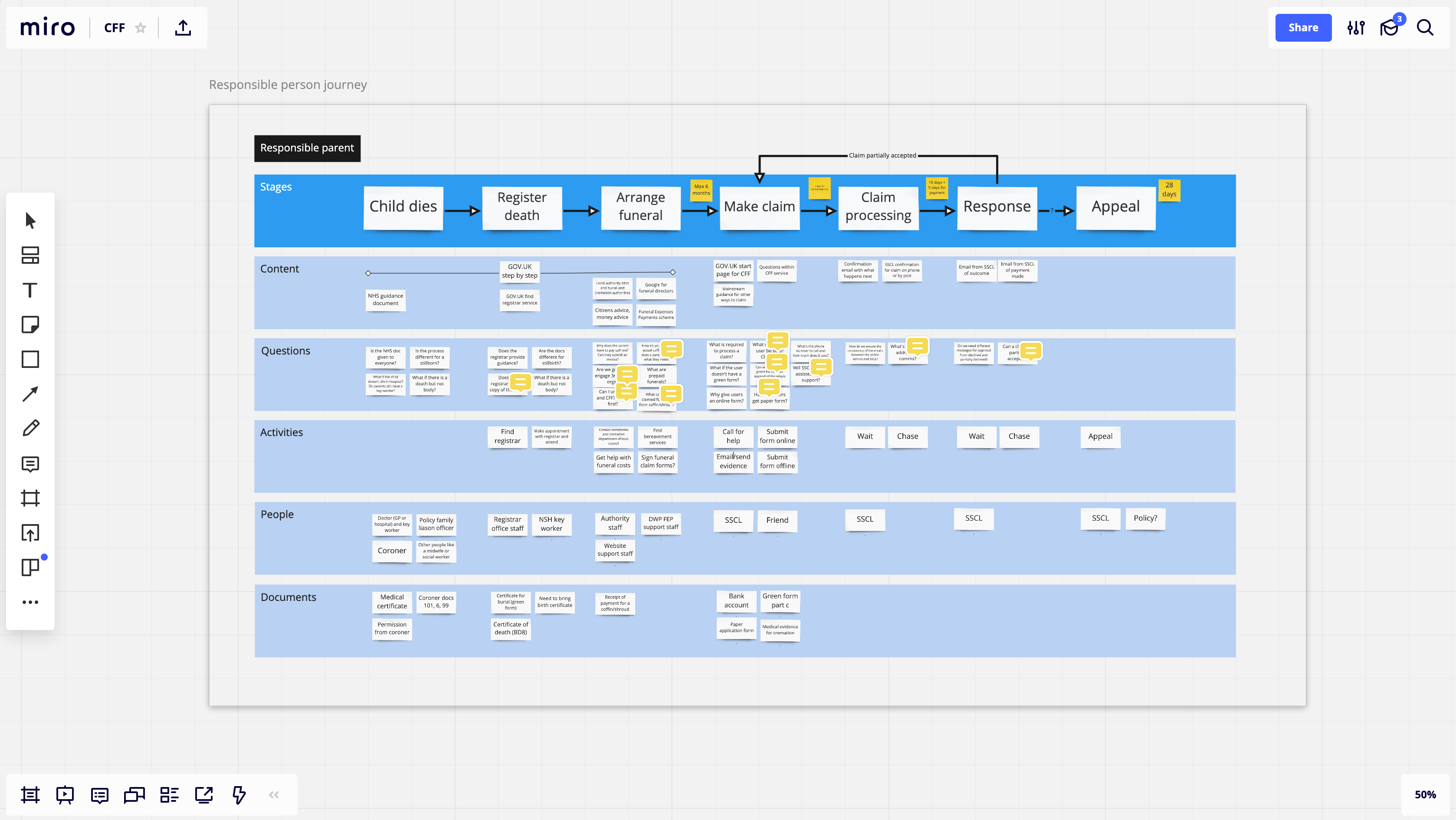
I planned and facilitated workshops to map the end to end journey. This helped us to understand the process, spot gaps and jot down ideas quickly as a team.
We used the map to prioritise additional tasks, like doing more targeted desk research and getting clarification about the policy.
4. Feedback from the wider community
We spoke to the cross-government design community to ask questions and get feedback on our designs as early as possible. I’ll provide some examples of this later.
Shorthand form design
In the early stages of form design there’s often lots of changes to the content and the order of the questions.
So instead of designing in code, which takes longer, I worked with our content designer and researcher using Google Docs. We used shorthand syntax to represent different form controls.
For example, brackets for radio buttons and square brackets for checkboxes.
We also used the error templates from the GOV.UK Design System to set the validation rules and write error messages ready for the live service.
Question protocol mapping
As part of doing the hard work to make things simple for users - especially in this sensitive situation - we only wanted to ask users questions that were absolutely necessary.
We created a question protocol map using Google Sheets. Doing this helps to know why you’re asking every question.
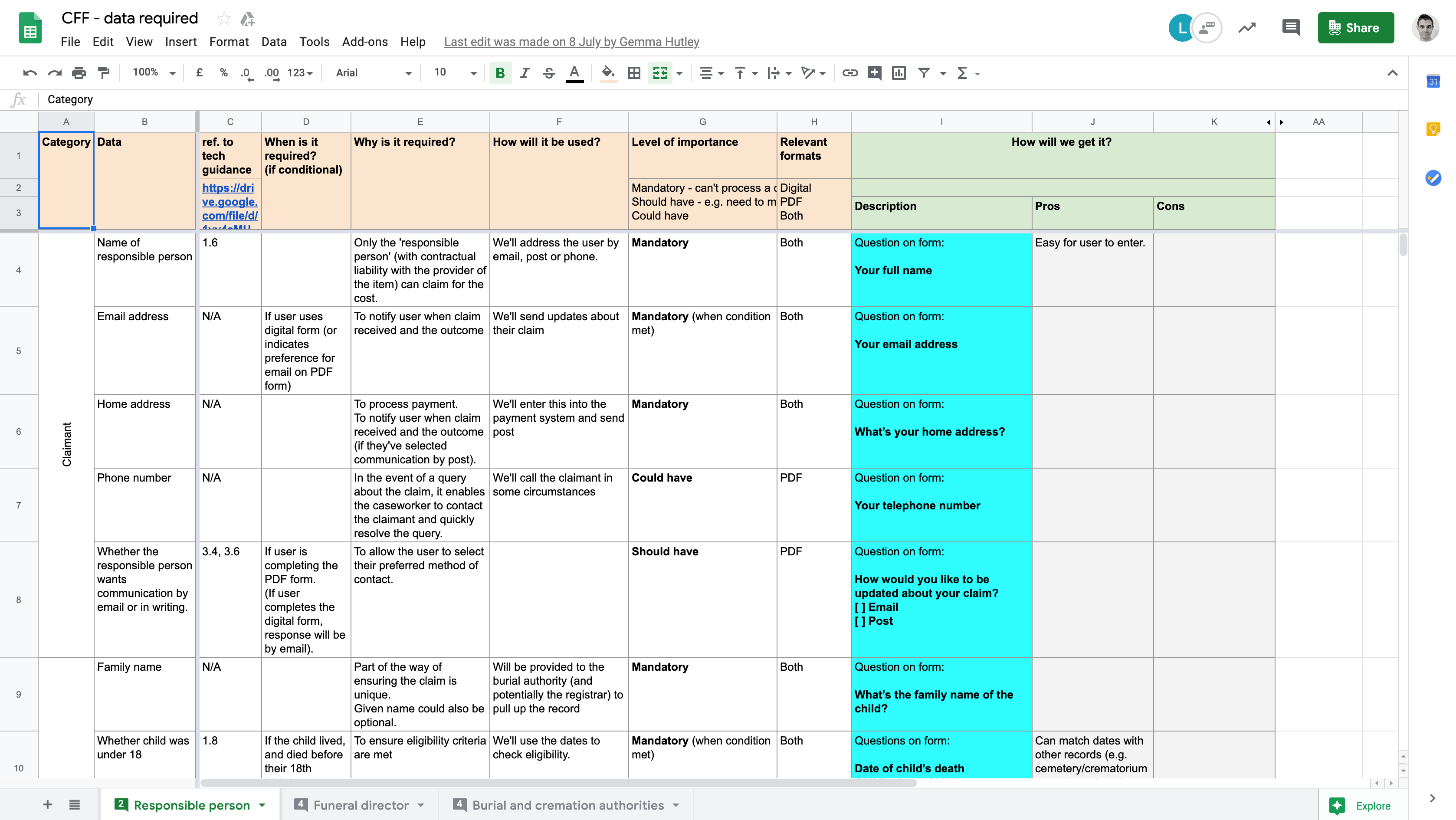
The map has columns for clauses from policy, form fields, data needed, details of how it will be used, and the level of importance. Rows represented the data being captured.
I organised a workshop with our user researcher and a colleague from the operations team to run through each row of the map.
For example, we ran through what will happen when the user doesn’t have the burial or cremation certificate. The answer was: the caseworker will contact the cremation or burial provider to confirm the funeral took place.
We then focused on what the cremation or burial provider needs to be able to do that. As they don’t need the certificate for burial or cremation, we removed that question.
By the end of the workshop, we’d removed many questions and simplified the claims process for both claimants and caseworkers.
Using the Form Builder platform
When the shape of the form stabilised, we began using the Form Builder platform.
The Form Builder is pretty new, so along the way I noted down issues with some of its components, ranging from accessibility issues and the inability to set certain content.
Once prioritised, I was able to work with our developers to fix some of these issues and make the Form Builder even better.
Role play research
In the last 2 weeks we found a small amount of time to test the service with a couple of bereavement charities.
We asked participants to act as someone who had lost their child, incurred funeral costs and wanted to make a claim.
On the whole, participants thought the service was fast and simple and were surprised that they didn’t have to provide much information to make a claim.
We found that some participants weren’t sure they were eligible for the service or what exactly they could claim for, for example, the cost of a nicer urn.
We used their feedback to improve the content to help users understand more about who the scheme is for and what it covers.
Including people who don’t have an email address
Iteration 1
One of the first questions we added to the form was to ask for the user’s email address.
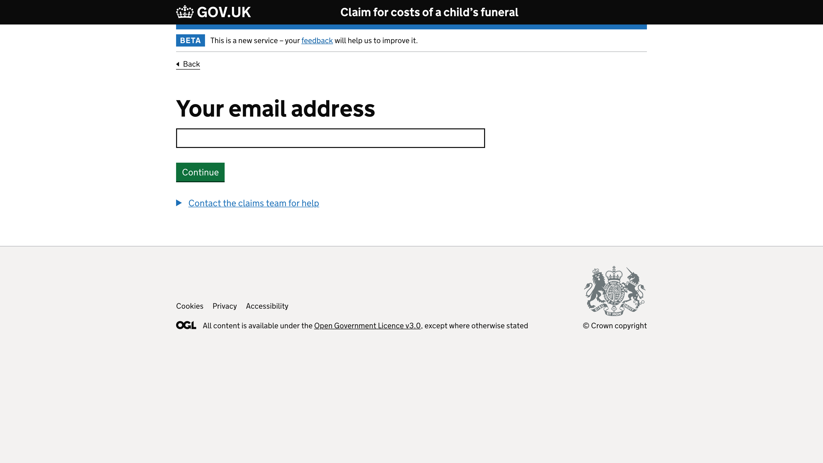
But we realised that this could create a potential barrier for people who don’t have an email address or who prefer to be contacted another way.
Iteration 2
We thought a branching question would be long winded for this. So we designed a version that asked users how they would like to be contacted.
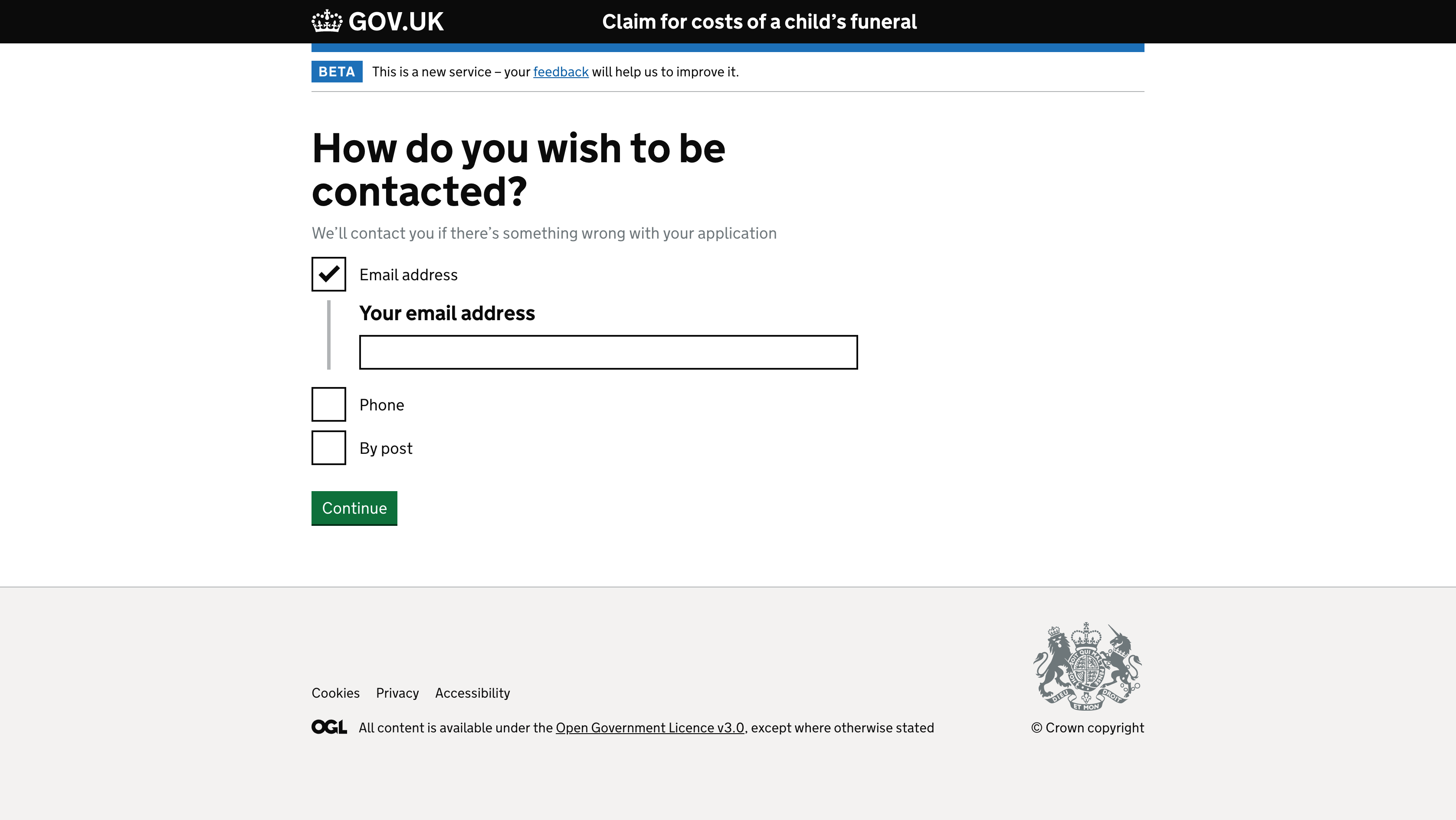
Subsequent screens had additional details based on their choices. Like an address form if they selected ‘By post’.
But this didn’t make sense because we needed a postal address to process their payment, regardless of their contact preferences and the service wouldn’t be able to support telling claimants the outcome of their claim by phone.
Iteration 3
We went back to asking for an email address. But this time we told users how they could proceed without an email address.
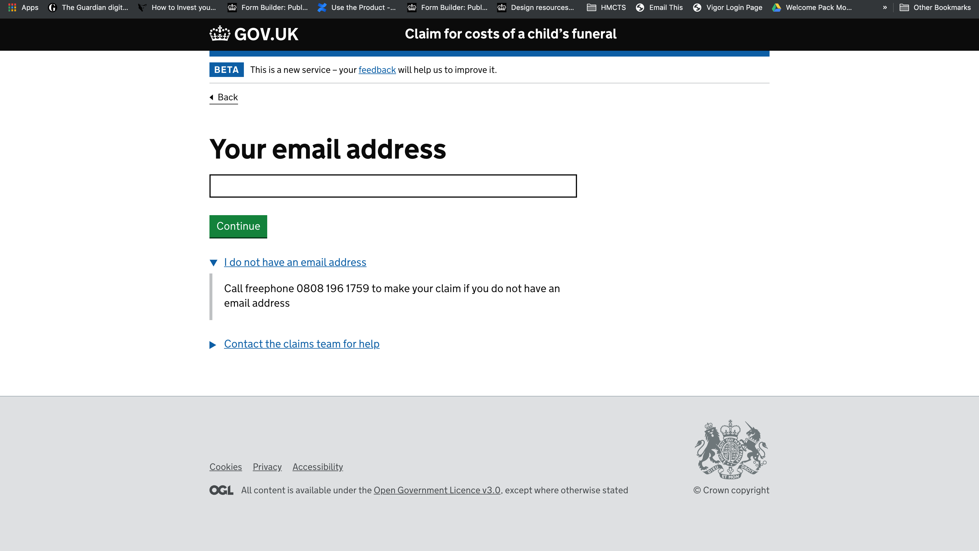
This seems sensible based on our assumption that most people who use a digital form prefer to get a response by email.
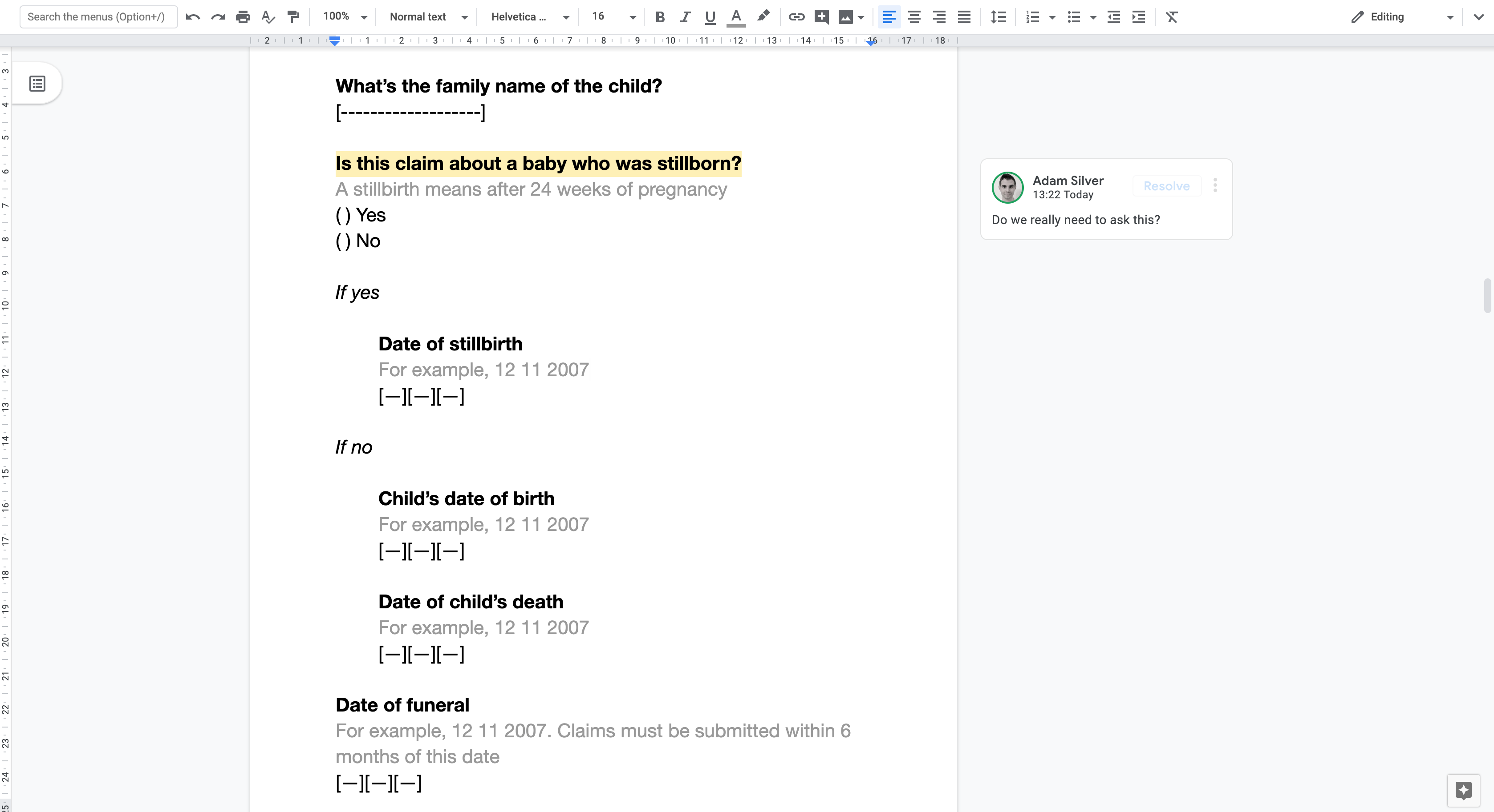
Asking for the child’s name
Iteration 1
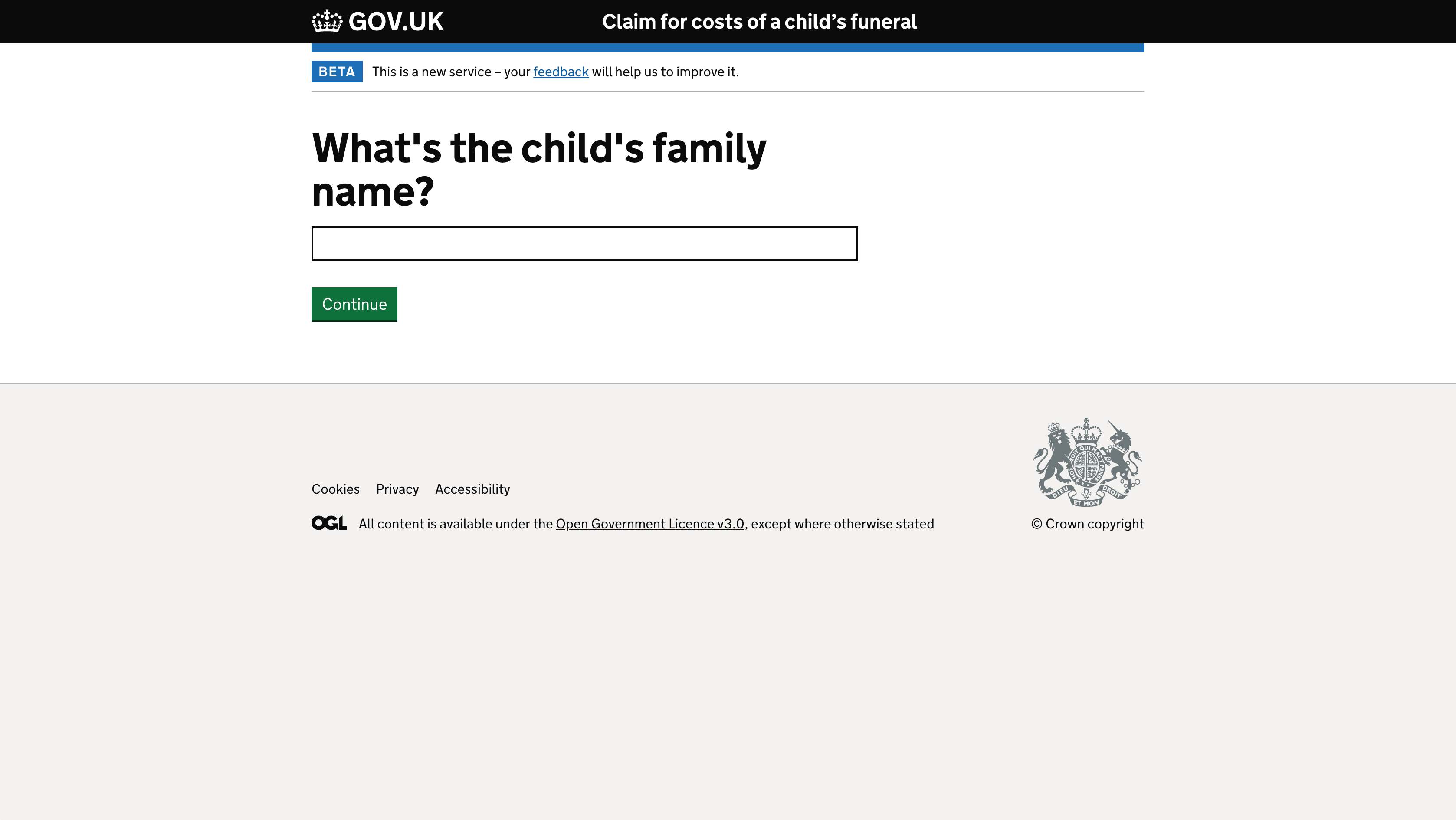
Not all children who die have a first name so we couldn’t rely on this information to verify a claim. So we decided to only ask for the child’s family name.
Iteration 2
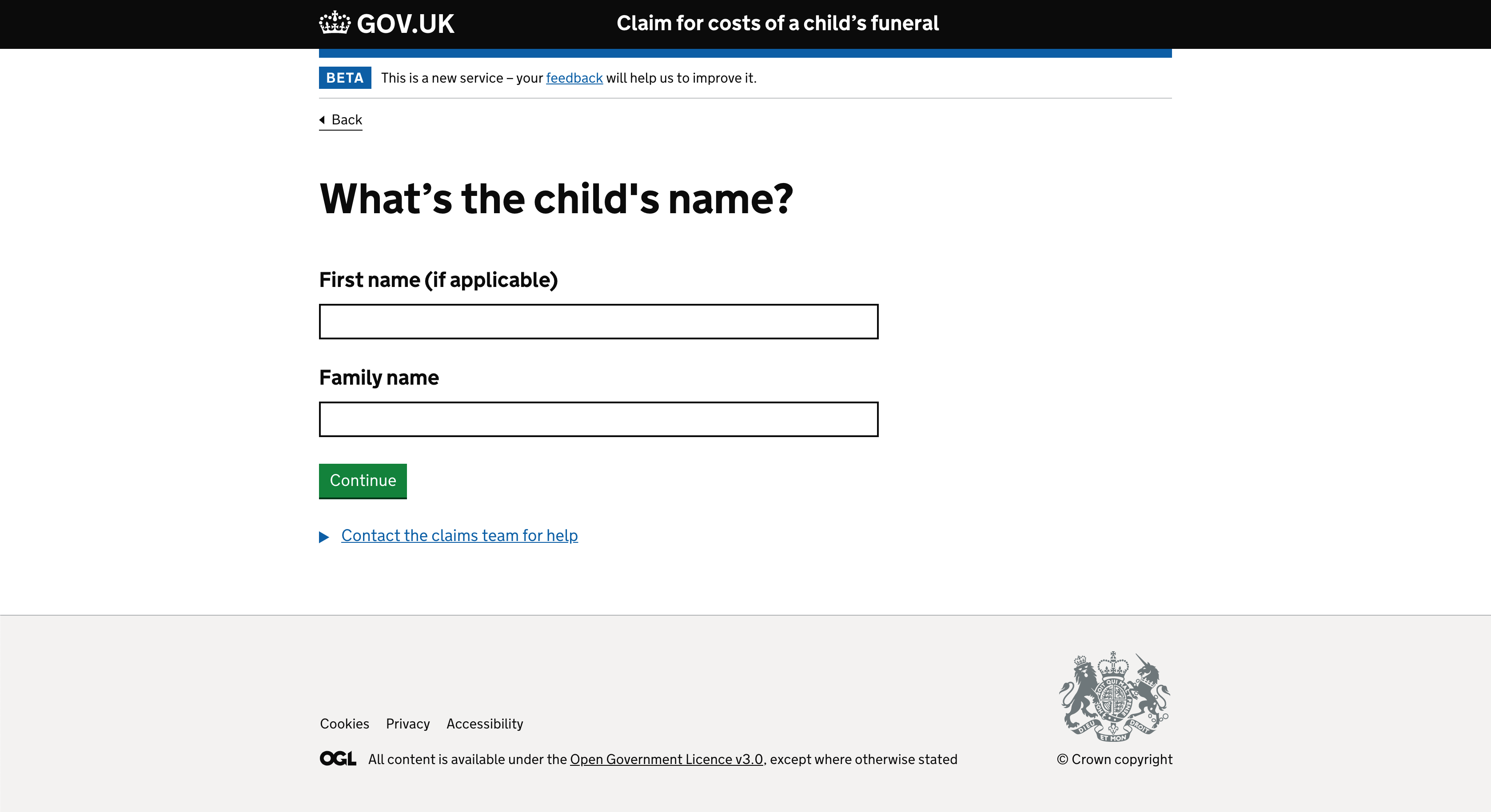
Research carried out by the Child Bereavement UK charity shows that parents fear their child will be forgotten after they die—so mentioning a child’s name in correspondence is advised.
We added a field to let claimants enter the child’s first name if they want to. That way we could use it in subsequent communication.
Helping people upload receipts
The service asks claimants to upload their receipts in order to validate their claim. File uploading is a complex interactions for users.
Iteration 1
Before needing to upload receipts, the service asks users what they’re claiming for using checkboxes. The initial design consisted of a single screen with a file uploader.
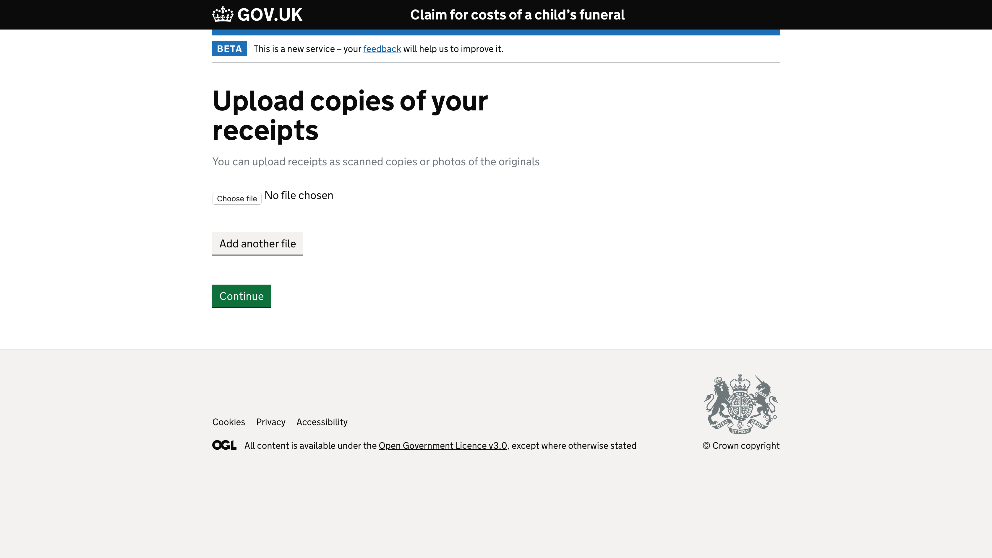
The claimant can upload their receipts and continue. But if the user doesn’t have a receipt they get stuck in a deadend.
We couldn’t make the question optional as this could cause users to skip the question. As a result this could slow down their claim or put their claim at risk of being rejected.
Iteration 2
If a user doesn’t have a receipt caseworkers need to know why.
The first iteration, asked users for this information in a question below the upload field.
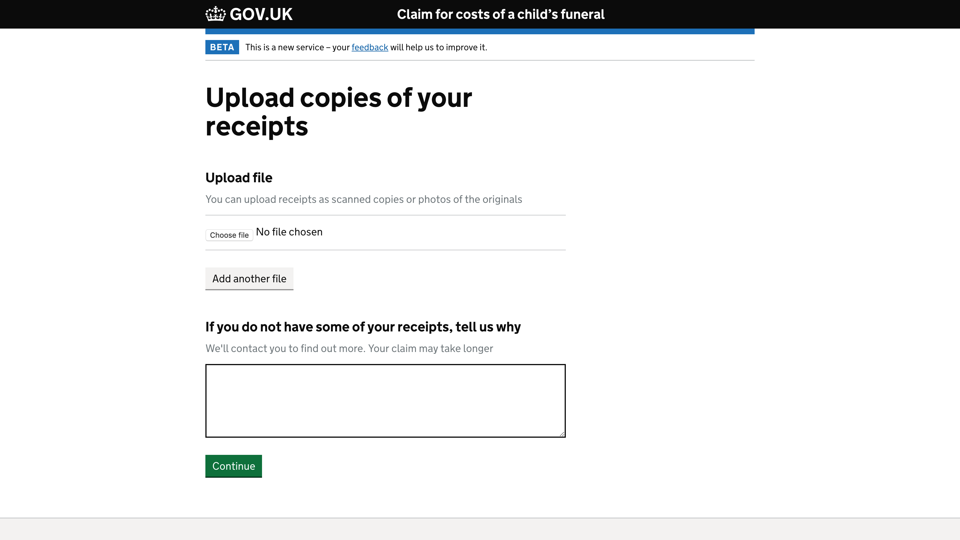
Users can answer either question or both questions. This is problematic because it’s not clear, it’s error prone and means caseworkers have to attribute receipts to the reason.
Iteration 3
I initially thought about adding a branching question to ask users whether they have all of their receipts or not. But they could be missing just 1 receipt which really meant we needed to provide 3 options:
- Yes I have them all
- No, I don’t have any receipts
- I have some of my receipts
Here’s what the screen looked like:
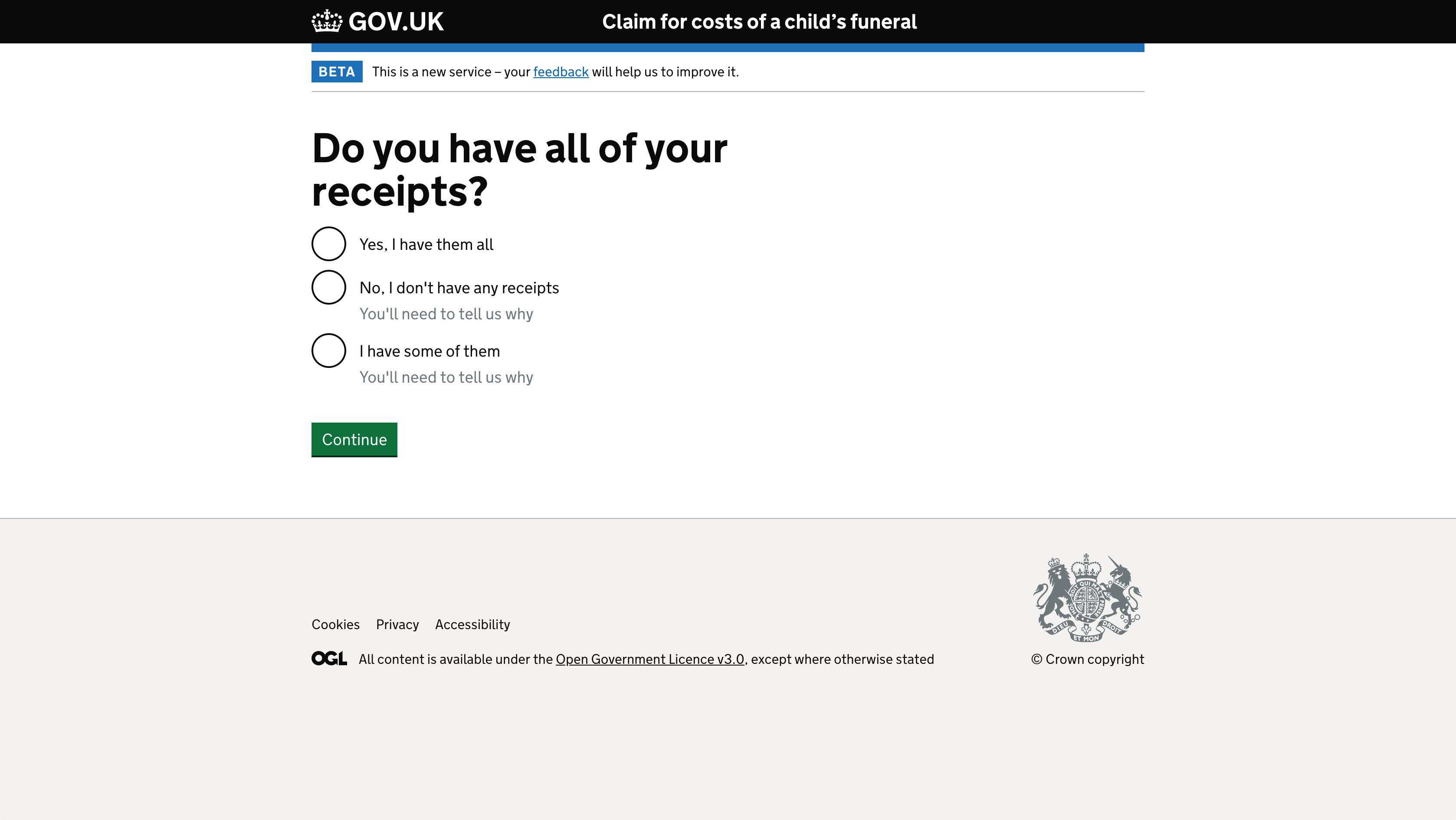
This approach is problematic because:
- it could encourage users who have receipts to not provide them which could delay their claim
- the answers are longer and harder to understand
- users need to remember what to upload in subsequent screens based on what they answer here
Iteration 4
I shared this dilemma on the cross government Slack channel.
All the feedback was great, but in the end we used Amy Hupe’s suggestion to ask whether users had receipts for each item being claimed for. If yes, they upload the receipts. If not, they explain why.
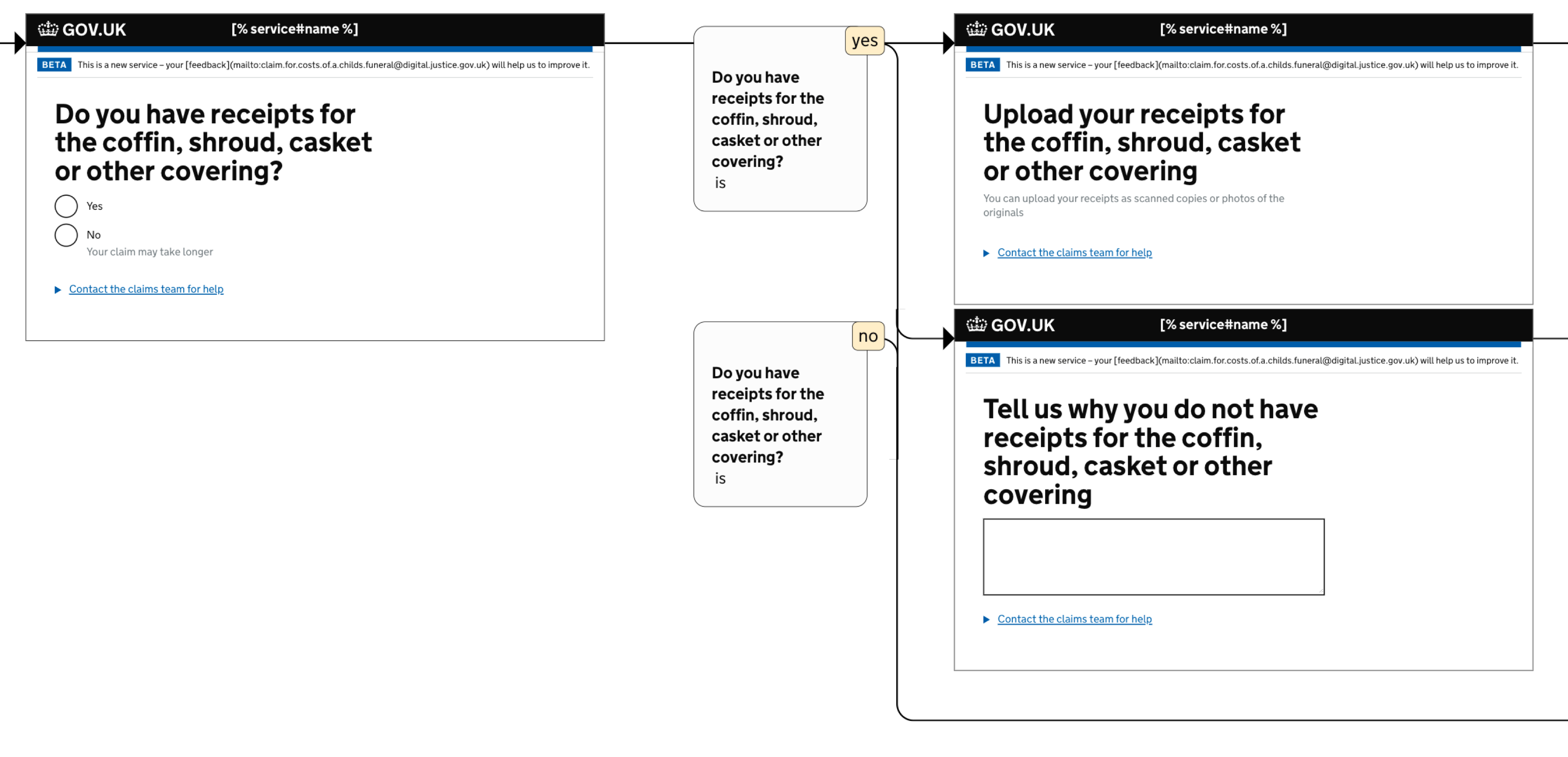
This involves more screens, but it keeps the cognitive burden on the users low. It leaves little room for error, and users are guided step-by-step through a challenging process, during a time when they’re most vulnerable.
Helping people make a declaration
At the end of the form users need to make a declaration before they submit a claim to say that they know it’s a criminal offence to knowingly submit false information.
Iteration 1
Our first idea was to give users a checkbox at the bottom of the ‘check answers’ page to confirm they have read and understood the declaration.
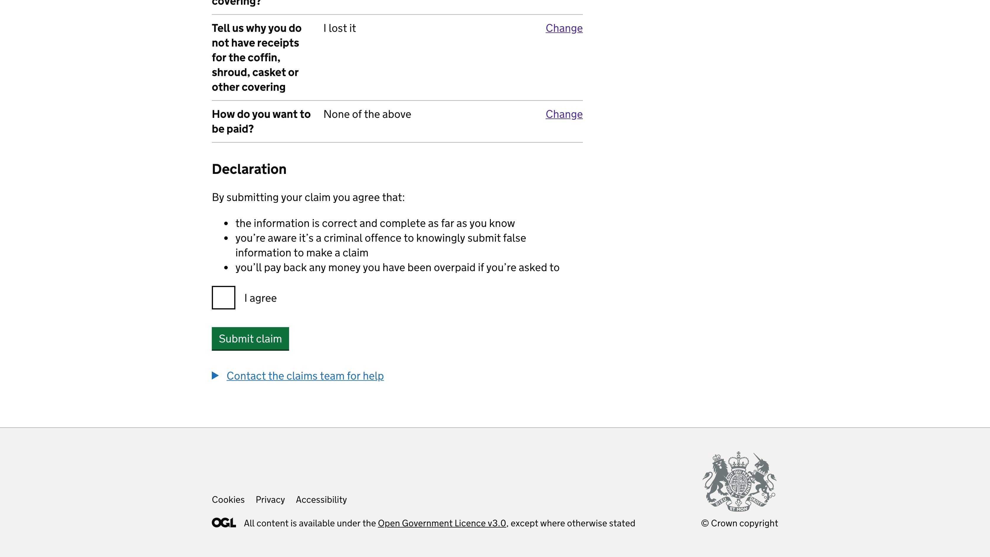
But:
- it’s not clear that clicking a checkbox carries more legal weight than just pressing a button
- there’s some evidence that people have become so used to the check-to-agree pattern, that they’ll just tick it without reading it anyway
- it’s another question to answer
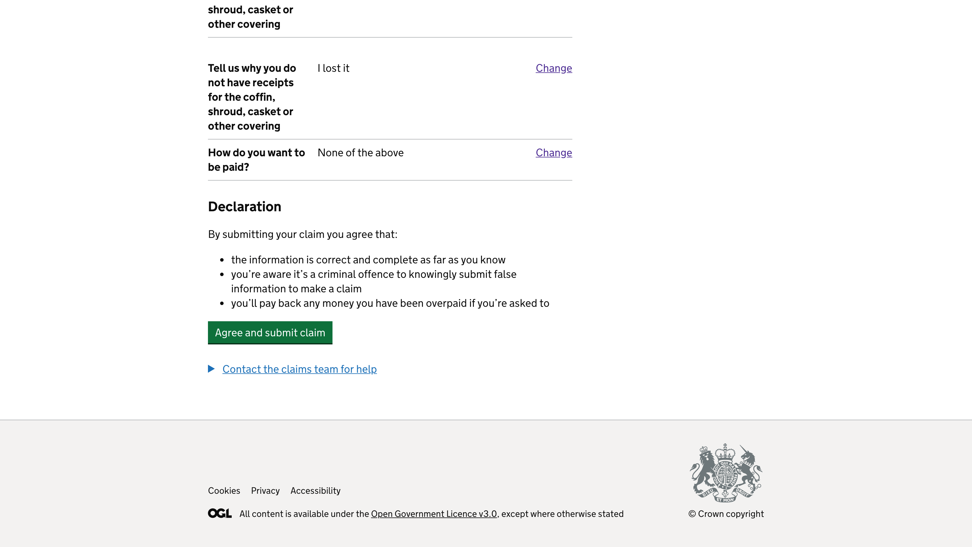
Iteration 2
Instead of a separate checkbox which says ‘I agree’, we updated the button text from ‘Submit claim’ to ‘Agree and submit claim’ which avoids an additional question that’s not valuable.
Results
We launched the service in just 6 weeks. You can see it here:
https://claim-for-costs-of-a-childs-funeral.form.service.justice.gov.uk/
Thanks to the team for making this happen in such a short space of time. And thanks to Alex Nash, Martin Oliver, Amy Hupe and Sonam Sony for helping me write this.