3 common examples of button text that degrades UX and how to rewrite them so they’re clear
A lot of designers love to save space at the cost of clarity and prioritise aesthetics over content.
But once you nail the foundational interaction design patterns, content is often the most important part of design.
Button text is a perfect example of this.
Once you design your buttons, it’s time to focus on the text.
Now on the one hand it’s so subtle that it’s barely worth discussing.
But on the other hand, the small details matter. And once you follow the rules it’s only slightly more effort to get it right than it is to get it wrong.
And yet there are a lot of badly described buttons out there.
Here’s 3 common examples:
Example #1: “Next”
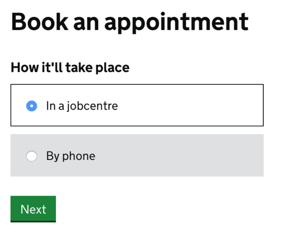
“Next” is used a lot in multi-step form flows.
But it’s abrupt and inconsistent with 99% of button text. As it’s not a verb it cannot be used in combination with other actions. For example, “Save and next” doesn’t make sense.
Use these instead:
- Continue
- Save and continue
Example #2: “Done”
“Done” is sometimes used at the end of journeys or on edit screens.
But it lacks clarity. It doesn’t say what the action is.
Use these instead:
- Return to notes
- Close note
Example #3: “OK”
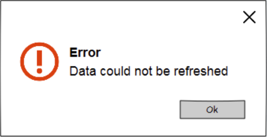
“OK” is often used in dialogs and banners as a way to close them.
But it’s ambiguous and unclear what will happen as a result of clicking it.
Use these instead:
- Close
- Agree and close