3 questions to evaluate design patterns and avoid unnecessary work that degrades UX
There’s a new form design trend going around:
Buttons inside inputs.
Anthony Hobday mentioned it by asking his audience if there was any significant difference in usability between these 3 designs:
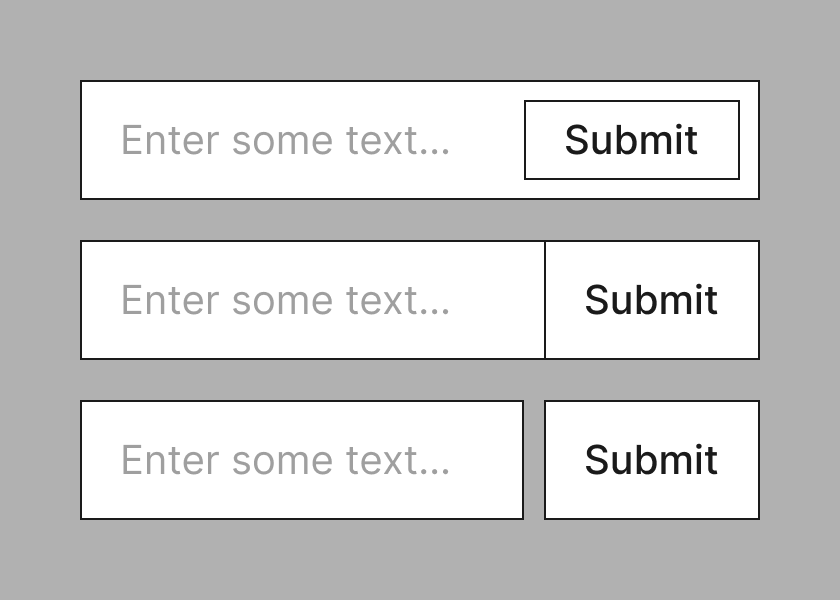
- Button inside the input
- Button touching input
- Button next to the input with space between
Guess which one I recommend.
One thing I know is that it’s hard to convince fancy-pants designers to practice boring design. And I hear the same from other UXers all the time.
It’s a tough one.
But when it comes to the button-inside-input pattern, it’s funny because on the face of it, it’s not that fancy and it seems harmless?
But then again, that’s just not how I design. The idea of doing something like this, and then testing to see if it doesn’t degrade UX. That’s backwards.
Because what’s the purpose of design?
The purpose of design is to solve problems
Not made up “I’m bored so I’ll come up with something new” problems.
Real ones.
That’s literally what design is.
So then you have to question why you’d put the button inside the input in the first place. And I think you’ll find the answer is…
“It’s cool”.
It’s definitely not because the designer did research and watched people struggle when the button was separate from the input (unless of course they positioned the button miles away but that’s obviously bad design).
And really that’s where the story should end.
Because it’s not solving an actual problem.
But as designers we’ll be faced with these patterns in one way or another. A colleague asks for crit. Someone shares a blog post advocating the new cool thing. Etc.
So how can we evaluate these patterns, avoid unnecessary work and ultimately avoid patterns that degrade UX?
Start by asking these 3 questions:
Question #1: Does research show this pattern solves a problem?
This question gets to the heart of the matter.
Most fancy patterns have come directly out of a designer’s head. They aren’t born out of using boringly simple patterns and watching users struggle with them.
It’s ironic that the act of being novel is the very thing that degrades UX.
Question #2: Are there any potential usability issues with this pattern?
This question helps to evaluate the specific solution.
Does the thing look like what it is? Is it unconventional? Does it work on small screens? Does it work well for keyboard users? Etc.
This gives rationale against a particular design.
Question #3: How much effort is it to build?
This question helps to prioritise the pattern against other work.
If the pattern takes a lot of effort, or more effort than it should, then that’s a good reason to deprioritise it.
Designers should be pragmatic.
Here’s my response to Anthony
I’d avoid anything contentious unless you want to spend time researching with a diverse set of users to prove it doesn’t degrade UX (effort and value aren’t in balance here).
Option 1 (button inside input) is contentious because it’s not clear where the input starts and ends. The focus outline of the input should be around the input, not the input and button. It’s also more effort to build.
Option 2 (button touching input) is fine as long as the button is clearly distinguishable from the input (by using different a colour perhaps).
Option 3 (button next to the input with space between) is best and clearly distinguishes the separate elements which do different things.
Bonus: lose the placeholder text as it degrades UX