Avoiding tab styles for navigation
I work on a service that lets users manage teacher training applications.
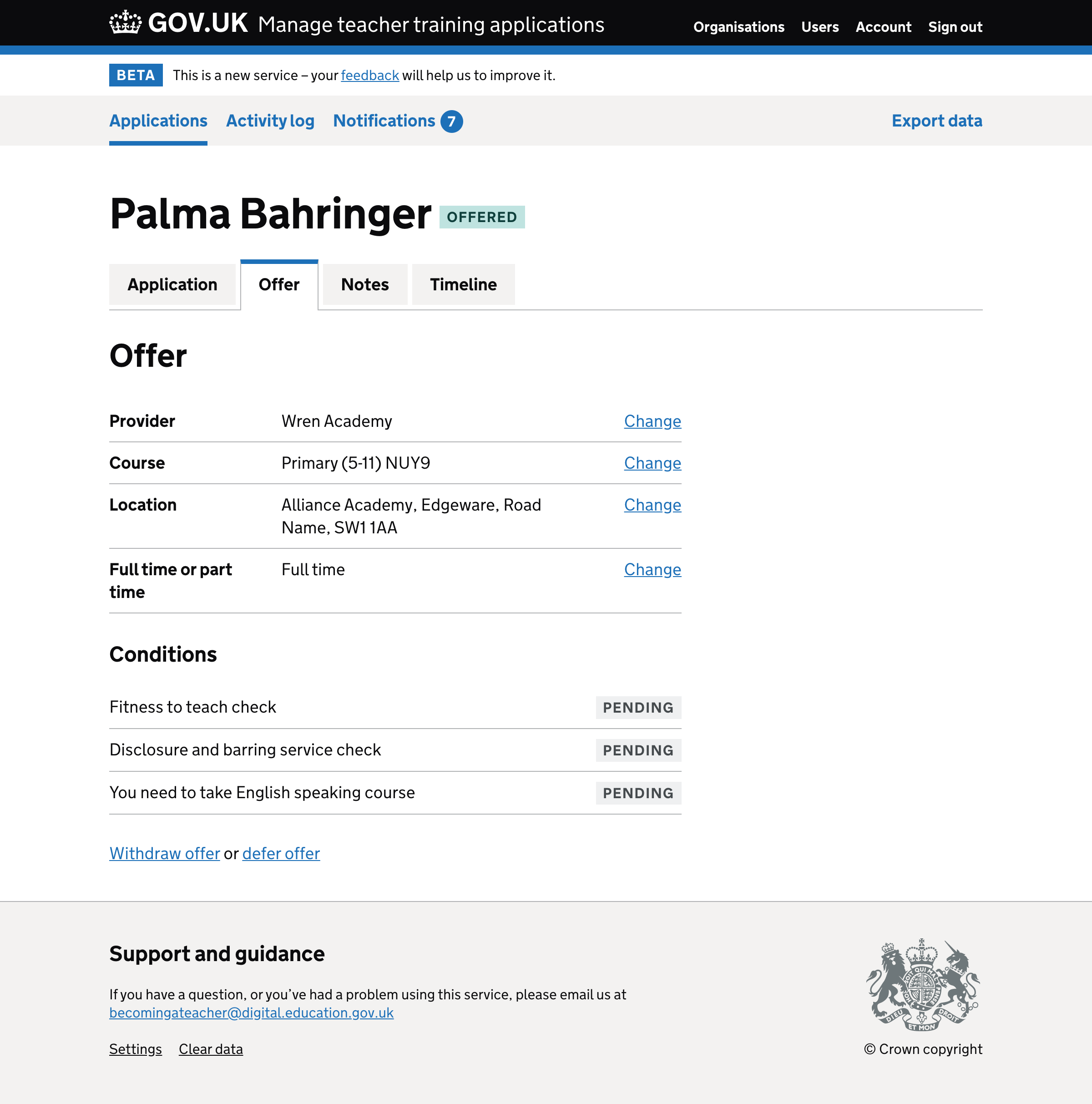
The screen below shows our initial design of the navigation bar. The items are links but styled like tabs.
But this design is potentially problematic. Here I’ll explain why that is and what we did about it.
The problem with styling links as tabs
Styling links as tabs is deceptive – when a link is clicked, the content is shown after a page refresh with the focus moving back to the top of the viewport.
But tabs don’t work like this – when a tab is clicked, the content is shown instantly without a page refresh and with the focus remaining on the tab.
Keyboard users may expect to be able to use the left and right arrow keys in order to switch tabs. This wouldn’t be expected with a list of links.
And (sighted) screen reader users may expect certain functionality, like using a shortcut to move focus to the associated tab panel or announcing which tab is selected.
Tabs should only look like tabs if they behave like tabs otherwise it can be in disorienting and confusing for users.
What we did about it
As our navigation bar doesn’t behave like tabs, and because we want to reduce the risk of confusion, we moved away from tab-like styles.
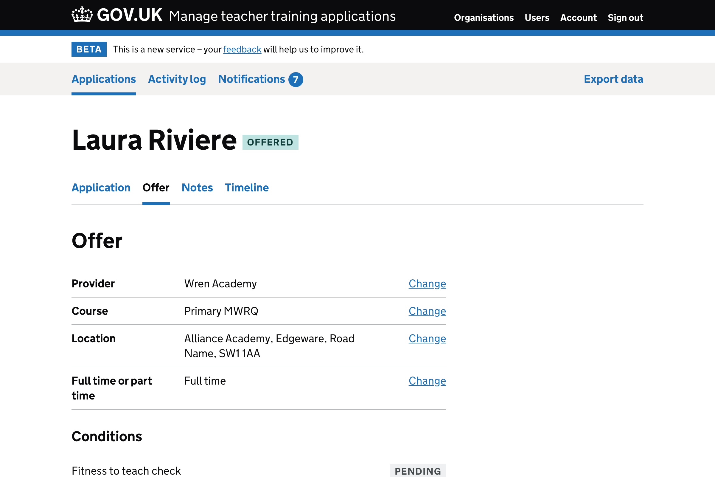
‘But they still look a bit like tabs’
Admittedly the new design still looks a little like tabs.
I think that’s because many sites style their tabs in a less traditional way.
But there’s nothing we can really do about this.
Our service, like many others, consist of navigation bars and tabs that behave differently.
Using different styles for navigation and tabs gives users the best chance of using them effectively, efficiently and intuitively.
In conclusion
Styling links to look like tabs can make them harder to use.
This is unsurprising given one of the core principles of good design is that something should look like what it is.
Fortunately, it’s quite easy to avoid tab styles for navigation which gives users the best chance of operating tabs and links in the most optimal way.
And that means we can spend time researching more important and riskier assumptions.