How to avoid optional form fields with branching questions
One crucial form design principle is knowing why you’re asking every question.
We should only ask users for information we need to provide a service. For example, most sites that ask for age or sex, don’t need them to provide the service. Silly.
Silly because it requires more effort to complete more fields. It will probably stop some users from using the service. And it means having to store more data. All this for no purpose.
That said, sometimes we can ask users more questions. We can then use that information to improve their experience.
A simple way to show optional fields is to put ‘(optional)’ within the question’s label. But this is not necessarily the best experience for users. This is where branching can help.
Option #1: conditional reveal
Take a user who’s applying for a new passport. We could offer them the option to receive text message updates by providing their mobile number.
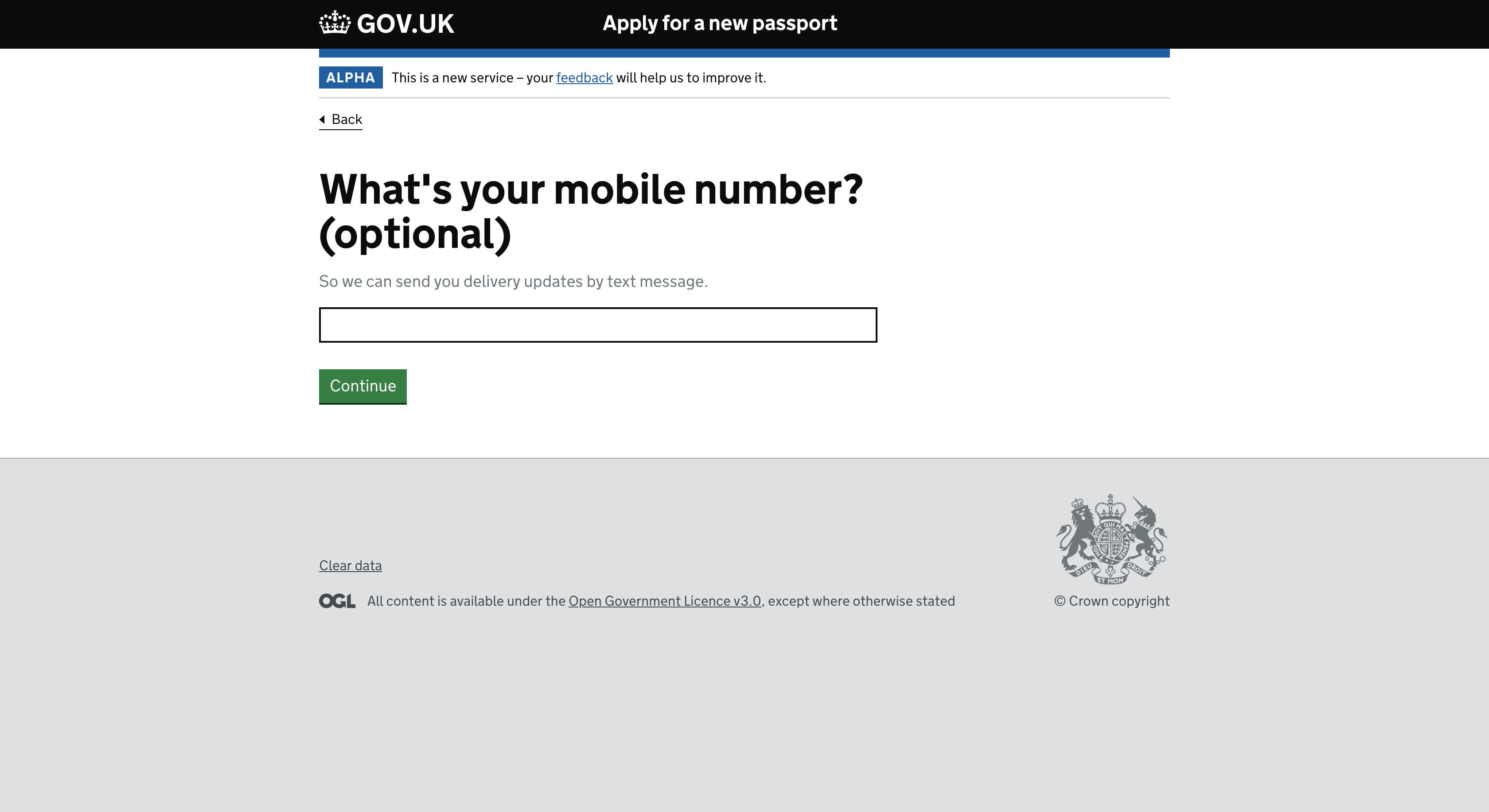
On the face of it, this looks well designed with a clear label and hint text explaining why the user might choose to provide this information.
The problem is that the design assumes users will read all the text to understand the question. But, most users do not read all the words on a page. But even if they did, we can let the design do the hard work, so they do not have to.
The Service Manual says to use ‘branching’ questions so people only have to answer questions that are relevant to them.
We can follow this guidance by first asking the user if they want to receive text message updates. If the user selects ‘Yes’, we can conditionally reveal the mobile phone field.
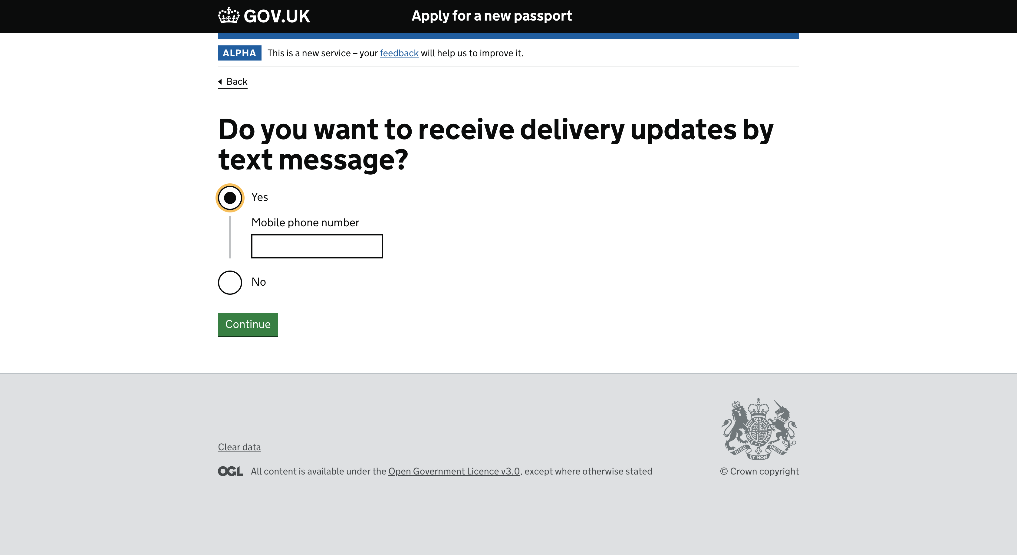
Importantly, the label clearly tells the user what they need to do without any hint text.
Avoid using inline radio buttons to reveal content because it may not be clear what the content relates to.
Option #2: separate page
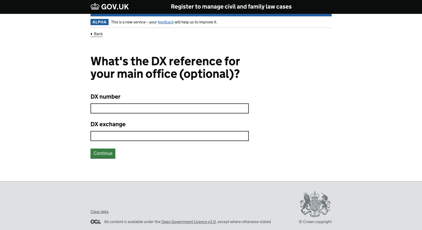
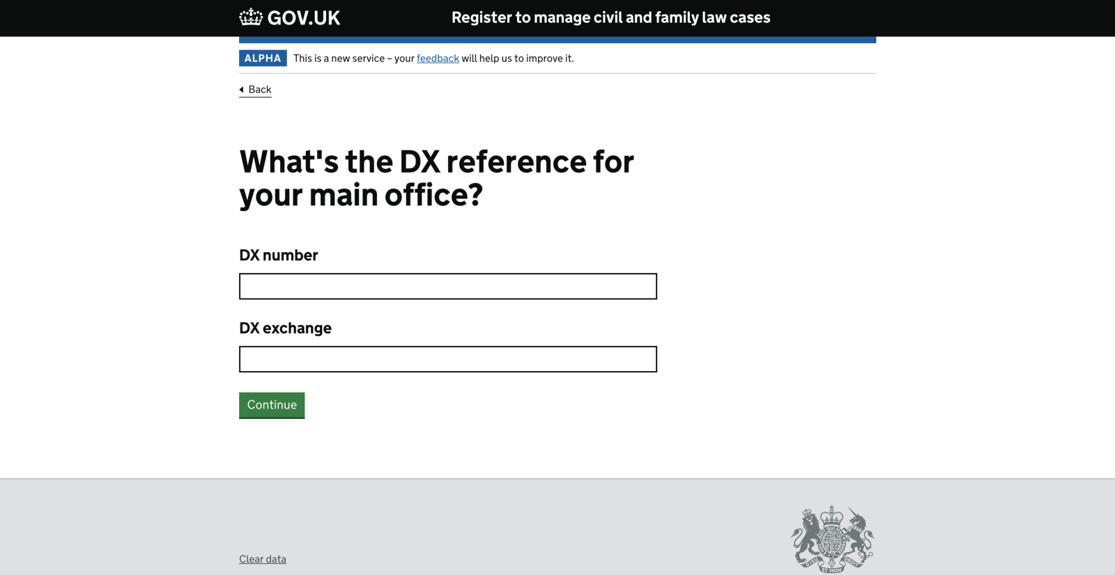
I’ve been designing a registration flow for solicitors where we ask users to provide their DX reference. The whole question, which is two separate inputs, is optional.
If the user submits the form without entering a DX number or DX exchange, the user is taken to the next step. Simple enough.
But what if the user enters a DX number and leaves the DX exchange blank? I can think of three less than ideal ways to deal with this.
-
Let users continue regardless. Give them a chance to clean up the details later, perhaps in a check answers screen or beyond.
-
Blank out both fields for the user behind the scenes. Let them continue as if they left both fields empty.
-
Show a (verbose) error message if the user only completes one field. Something like ‘Enter a DX exchange — because you entered a DX number, the exchange is needed to complete the DX reference’.
Instead of using the conditional reveal pattern from earlier, we could take the user to a separate page. First, ask the user if they have a DX reference.
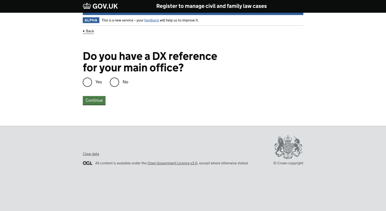
If the user selects ‘Yes’, take them to a new page showing the DX number and DX exchange fields.
Now we know the user has a DX reference both fields are required. Because of this, we do not need to:
- mark the question as optional
- have complex validation rules with verbose error messages
- mess up our database with partial data
Conditional reveal vs separate page
Both patterns adhere to the branching guidelines but it’s not especially clear when to use one pattern over another.
The conditional reveal:
- keeps the original question on the screen to provide context
- avoids a page load
- makes it easier for the user to change their mind without moving back and forward between screens
But revealing content in response to selecting a radio button may:
- confuse users who do not expect it—this may not be a problem as this approach becomes more common (within and outside the service)
- make the experience inconsistent and less predictable—you cannot reveal every kind of field this way, for example radio buttons within radio buttons
- not be spotted by all users, especially those who use a screen magnifier
- overwhelm users who have cognitive impairments
It needs JavaScript to work and gives a poor experience when JavaScript fails.
If you use something like a check answers screen, it may be difficult to present the questions and answers. Do you leave out the original branching question? If yes, would users know how to change their answer from ‘Yes’ to ‘No’?
None of these issues arise when using a separate page. This is why I’d start with one thing per page and only merge pages together when research shows that it works better that way for a diverse range of users.
Thanks to Steven Proctor and Amy Hupe.