I took David Hamill’s UX challenge (how did I do?)
In case you don’t know David Hamill, he posts regularly on LinkedIn.
And last week he posted a UX challenge to redesign the iPhone screen for accepting or declining a call while you’re already on one.
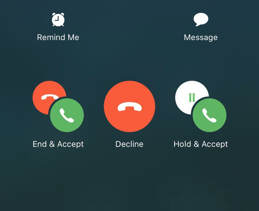
This is the current design:
Some of the issues may seem obvious to you at first glance, but I found the challenge a lot harder than I thought I would.
Let’s dive into the main issues I spotted before I walk you through my redesign:
Issue #1: There are too many options
This is time consuming and stressful especially as the user is already in the middle of a call.
Issue #2: The user has to make 2 decisions at the same time
This is because the actions like “End & Accept” impact the current call and incoming call which again increases cognitive load.
Issue #3: The icons are confusing
The red phone icon is used to end the current call or decline the incoming call which has dual meaning.
The same green phone icon accepts the incoming call regardless of whether the user ends the current call or puts them on hold.
Some of the options have 2 icons to be understood in combination to give meaning.
All of this increases cognitive load.
Issue #4: It’s unclear what declining the call does
This could just be me, but the “Decline” option has me wondering how it impacts the incoming call. Does it abruptly cut them off, send them to voicemail or carry on ringing?
Initial thoughts
- Use a 2-step flow.
- Reduce the number of options.
- Show a notification after the call to remind the user about the call they declined.
- Avoid icons (or at least don’t use the same icon across options with different meanings).
- Change “Decline” to “Ignore” so the user doesn’t worry about abruptly cutting the incoming call off.
- Be careful about using green for “accept” because people have been conditioned to select a green button as the obvious next step.
First attempt
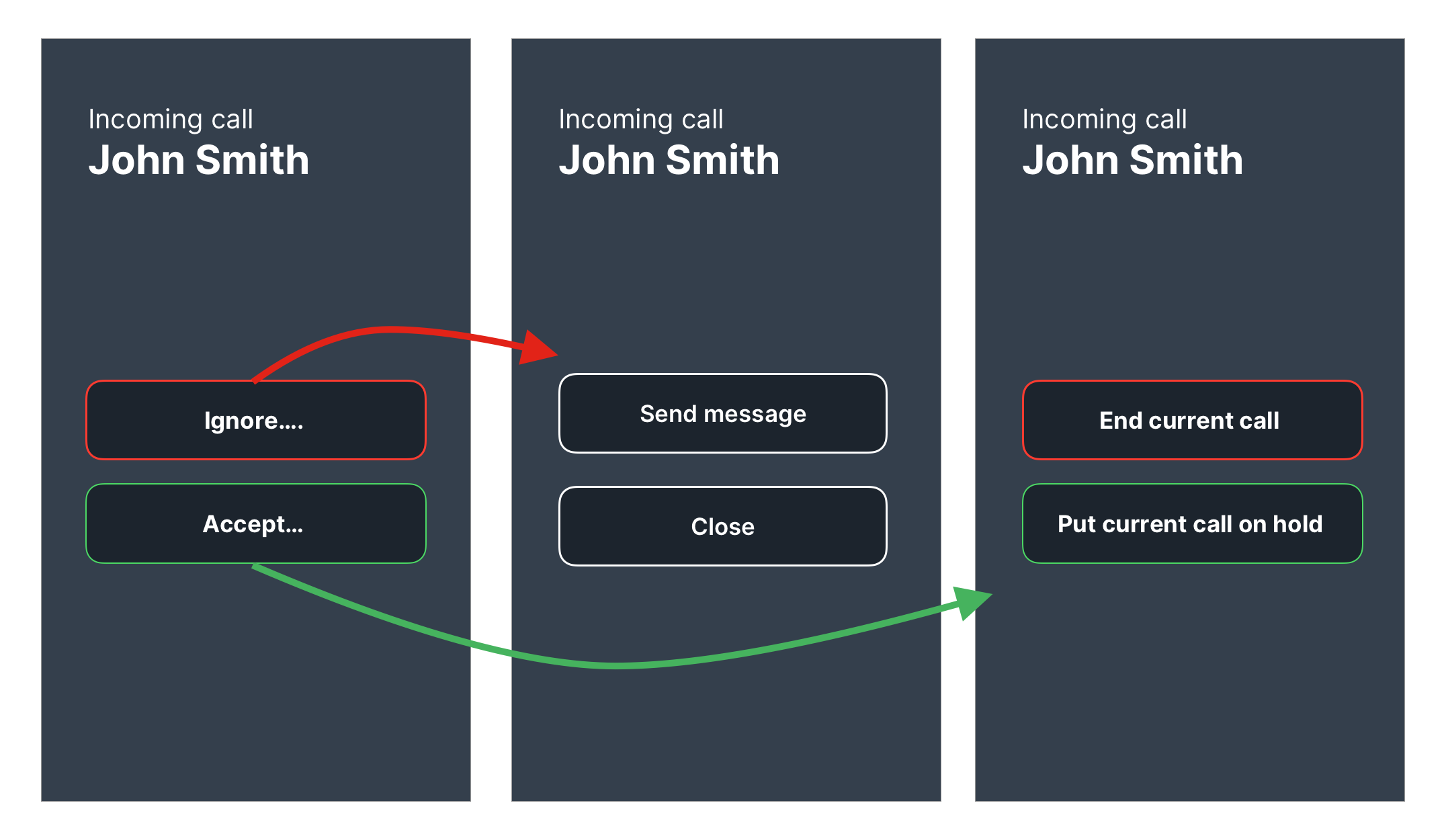
Selecting “Ignore” shows 2 options:
- Send message
- Close
Selecting “Accept” shows 2 options:
- End current call
- Put current call on hold
Much better but:
- the ellipses could make it seem like the action will not be taken immediately
- the 2-step flow may still be too much for people in the middle of a call
- “Ignore” feels unclear
Second attempt
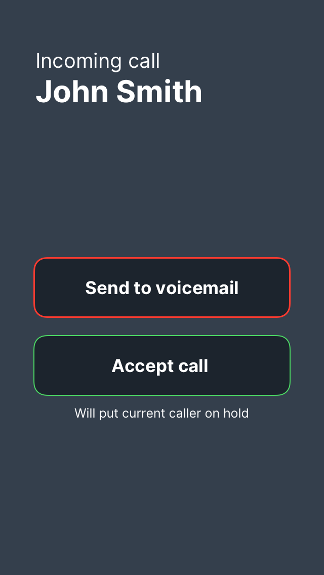
Changes:
- Reduced to a 1-step flow
- Removed the ellipses
- Changed “Ignore” to “Send to voicemail”
- Added help text under “Accept call” button
And that’s where I got to.
I don’t think it’s perfect but it’s moving in the right direction.