Stop using device breakpoints
I see it all the time. Designers, and developers alike, setting breakpoints according to their favourite device. When will we learn from our past mistakes?
When the web came along we settled on 640 pixel widths. Then a few years later, when larger monitors came to market, we settled on 960 pixels. We no longer cared about people with smaller monitors.
Then more years passed. The mobile web was born. Or more accurately, we could consume websites on our phones, which happen to have small screens. A million browsers came out. A million devices came out. And browsers gave us media queries.
At about this time, we decided to use 320 pixels for mobile. Why? Because a lot of us had the iPhone, and this was its width in portrait.
Then landscape mode. Then tablet (that’s still mobile right?). Then desktop. Then big desktop like super size thunder screens or whatever the hell they’re called. (I’m not Googling it because you know what I mean). Then TV. Then wristwatch and then…
You get the point. The web is not print. The web is the web and we have no idea what size screen our users have. We just can’t control that. And even if we could, the proliferation of devices means that designing for them is futile.
But there’s a few things we do know. We know our brand and our design. And, more importantly, we know our content. Content isn’t just paragraphs of text. It’s the things that are held or included in something.
We should always start with content. Without content, design is meaningless. We design to help users consume content. We don’t use content to help users enjoy our designs.
We often start designing with a box. And then we put smaller boxes inside it. Then later we fill in these boxes with actual content.
As Frank Chimero beautifully explains in The Web’s Grain, this is just about the worst thing we can do.
How can we possibly design something until we know what the content is?
I’ve witnessed designers finish their mock-ups and ask the resident content designer to make the content fit. Maybe even ask them to shorten their user-friendly content to make sure it doesn’t wrap and so forth. It may help the designer. It doesn’t help the user.
And when they check their design on landscape or on a device they don’t own, they get flustered. What they see as control, is really an unnecessary constraint on their design to a known set of device sizes.
Instead we should let content be our guide. We should set a breakpoint when and if the content requires it. We can call them content breakpoints or what Frank refers to as points of reassembly.
Take for example the subscribe form on MaintainableCSS. Taking a content-led, small-screen first approach, the button sits under the text box. And when there’s room, they sit along side each other.
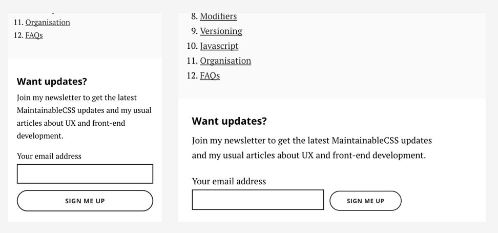
The media query uses a breakpoint of 36em. Why? Because that’s when there is an opportunity for content reassembly. The button and text control lose their affordance when they get really wide on bigger screens. So we can fix that.
And it’s only relevant to the subscribe form. There is no blanket rule that states that 36em means “big”. The breakpoint reflects the need of the module and content in question.
Technically it’s just a media query. But the mindset and the approach is what sets it apart. The design supports the content. Not the other way around.
This is why CSS frameworks cause problems by unnecessarily constraining our content to fit into a predefined grid. How can a CSS framework know what our content is? It can’t.
The term mobile first encourages us to think in terms of device. But the web isn’t a set of devices. The web is a continuum of edgelessness. That’s the coolest sentence I’ve ever written.
What it means is this. There is absolutely no point — whatsoever — in trying to work out the size of a particular device, in order to then define a codified responsive grid.
At best it’s constraining and at its worst, it causes problems.
Instead, let the content be your guide. If and when it breaks we can reassemble it with the necessary content breakpoint.
Responsive design frees us from the shackles of designing based on devices, which is impossible to get a handle on. Content breakpoints give people better experiences no matter what size device they have.