The billion dollar unsubscribe link
2 weeks ago I sent an email to 3,855 subscribers using ConvertKit.
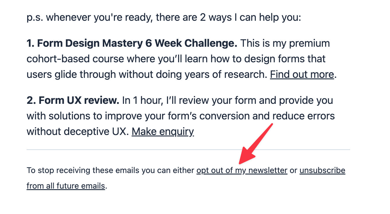
But 177 of them were instantly unsubscribed without clicking the unsubscribe link. What happened?
These subscribers work at organisations with strict security. Every link is automatically opened to check it’s not malicious.
Fine, except that:
- my subscribers were unsubscribed without their consent
- support agents spent a lot of time dealing with me and the issue
- I had to spot the issue; work out how to resubscribe everyone; and create a workaround so it doesn’t happen again
This is a billion dollar UX mistake
Here’s why:
- Support costs go up
- Customer retention rates go down
- Customer satisfaction scores go down
- Customer fees go down (you pay based on subscriber count)
Scale this up to 580,084 ConvertKit customers and 633 million subscribers and you’ve got a billion dollar mistake caused by a teeny tiny link.
Links are for navigation, buttons are for actions
To solve the problem do this:
- Clicking the unsubscribe link takes users to a page with a form
- Submitting the form unsubscribes the user.
The links can still be checked automatically. But only users can submit the form.
Good design puts users in control.
(Note: I’ve messaged ConvertKit’s founder about this and offered to help fix the issue. For now, I’ve used a workaround that takes subscribers to a Tally.so form. When submitted it triggers a Zapier automation that removes them from my newsletter.)