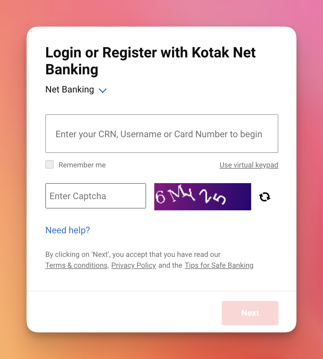
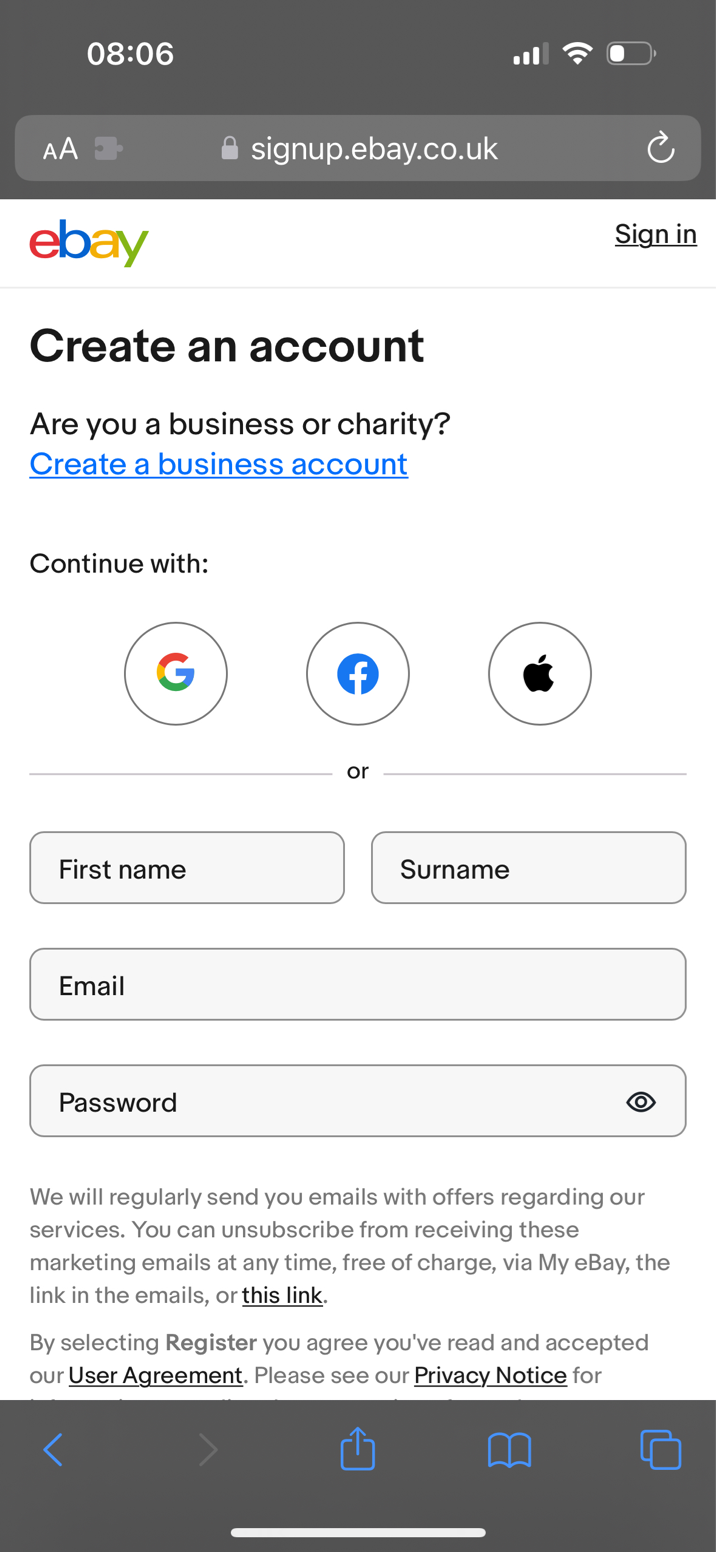
The problem with disabled buttons and what to do instead
In 2009 I prototyped a form that disabled the submit button until all the answers were valid.
The idea being: the best error is the one the user never sees.
But disabled buttons takes this rule to the extreme.
And as a result it can frustrate users or worse, cause them to give up completely.
Here’s why:
Problem #1: They don’t give feedback
When a form has mistakes, the user has to look at each field, spot a mistake and work out how to fix it.
Problem #2: They make the interface feel broken
If the user thinks their answers are valid, the UI may feel broken. If there are multiple errors and 1 is fixed, the button stays disabled. This feels unresponsive.
Problem #3: They’re hard to see
Disabled buttons have low contrast to signify they’re disabled. But this makes them hard to read, especially for users who have visual impairments.

Problem #4: They’re not focusable
This means keyboard users won’t be able to tab to the button. And users with poor vision won’t see the button.
This is confusing as most users expect to find a button to illuminate a clear path to proceed.
Problem #5: They’re deceptive
While disabled buttons have low contrast to signify that they’re disabled. It’s not always obvious. So some users still try and click them.
Problem #6: Users may not notice the button becoming enabled
This is because the button may be off screen (due to screen size or the length of the form). And if the button is on screen, users are focused on filling out the fields, not the button changing state.

‘Just validate as the user types’
No. Live validation is problematic. And it doesn’t solve all of the problems.
What to do instead
- Write clear label and hint text so users understand the question
- Start with one thing per page to reduce cognitive load
- Enable the button so users always get feedback
- Forgive trivial mistakes to avoid unnecessary errors
- Give clear error messages to help users fix the issue
Boring UX > clever UX