The problem with input masks and what to do instead
In 2010 I discovered input masks.
They seemed like a smart way to prevent errors. Because they help users follow a format. And they do so without taking up space.
But the truth is that this fancy pattern degrades UX.
Here’s why:
Problem #1: They’re confusing
For example, the cursor advances automatically to the next position. And placeholder characters can’t be deleted.
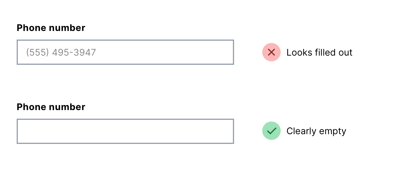
Problem #2: They may be mistaken for an actual answer
This is because the mask looks like an input causing using to submit the form with errors.
Problem #3: They make the interface feel broken
This is because typing a restricted character gets ignored.
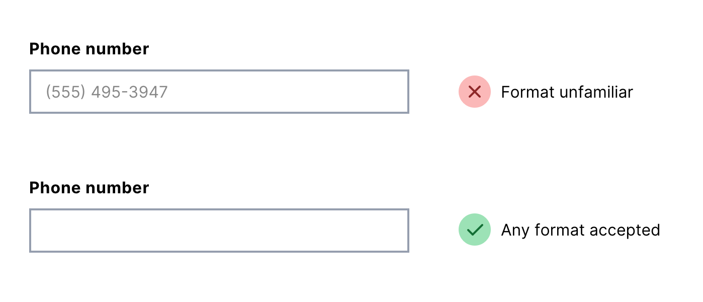
Problem #4: The format may be unfamiliar
For example, a phone number may require a country code which isn’t always expected and makes users work harder.
Problem #5: They’re misleading and verbose in screen readers
For example, they announce placeholder characters which aren’t part of the answer. And they don’t announce characters that were typed but ignored.
Problem #6: They can break text expansion
For example, using the text replacement feature on iOS, typing ‘zpho’ should be automatically replaced with my phone number. But a phone input mask will ignore it.
What to do instead
- Leave the input empty to make it obvious where the answer goes
- Let users type what they like so the interface doesn’t feel unresponsive and broken
- Allow multiple formats so users don’t have to fix something unnecessarily
- Allow users to check their answers either on a separate page or just below the field