The problem with placeholders and what to do instead
The placeholder attribute can be used to put hint text inside text inputs. When the user types, the placeholder text disappears to make room for the user’s answer.
Placeholders are popular because they save space and have a minimalist aesthetic. But using placeholder text for labels or even just hint text is problematic.
Here I’ll explain why that is and what you can do instead.
1. They’re hard to remember
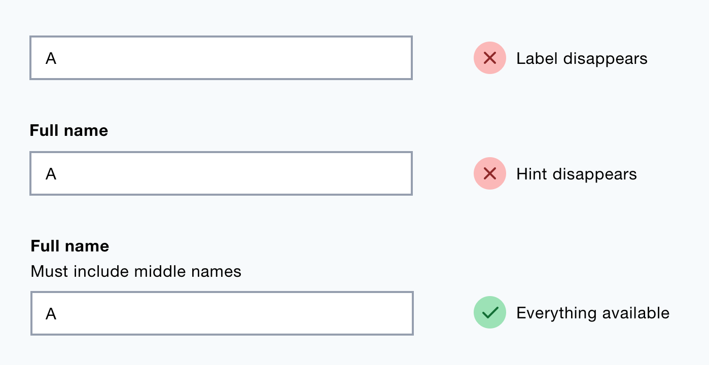
Placeholder text disappears when the user starts typing which means users have to remember the instructions while they’re trying to answer.
Users may need to delete their answer to check the instruction. This takes time and adds cognitive load.
2. They don’t have full support
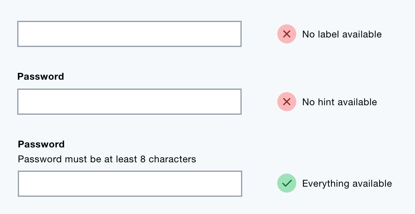
In browsers that lack support for placeholders users won’t see any instructions.
3. Fields lack clarity once answered
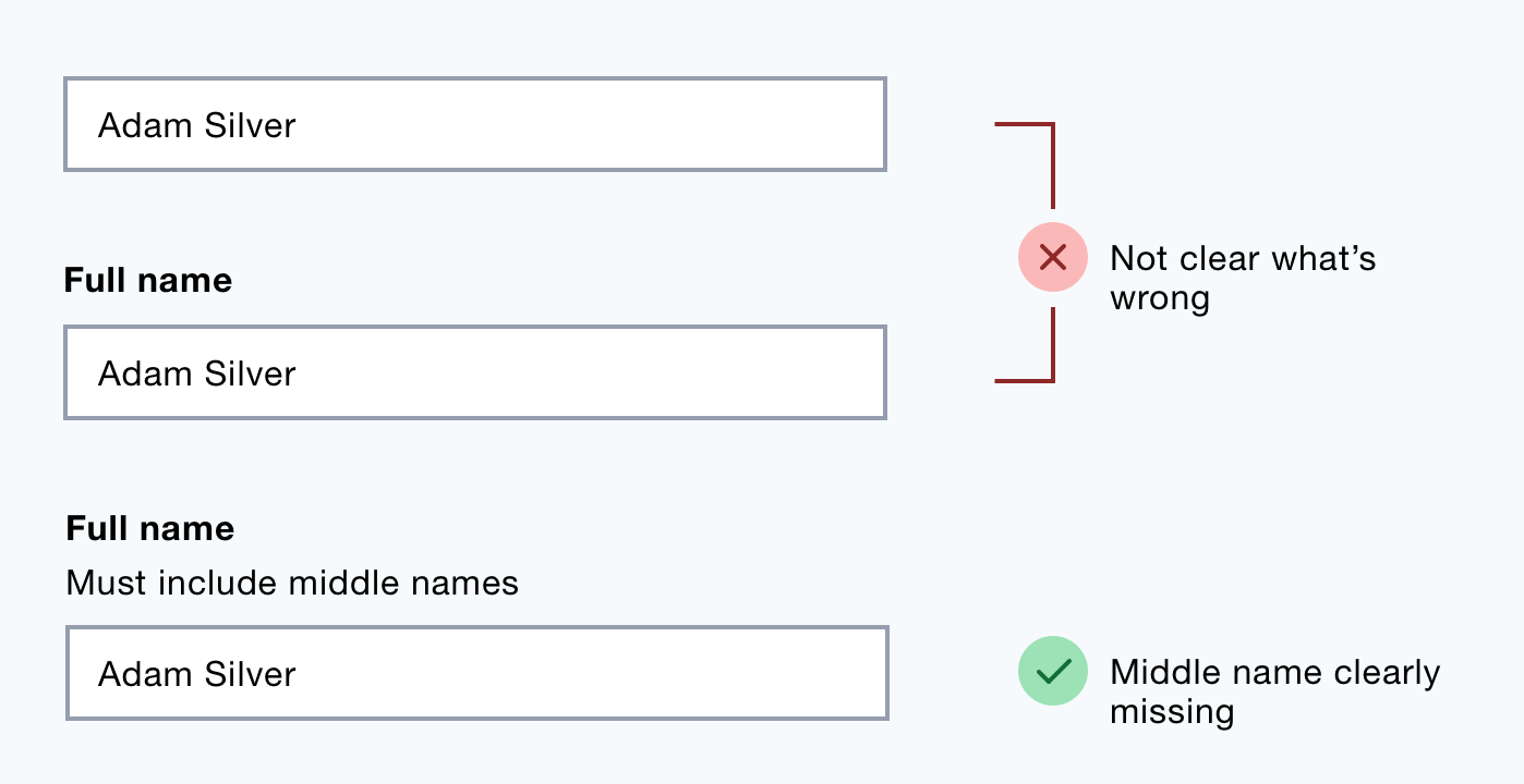
When a field has been answered it’s not clear what the value relates to or if it meets the formatting requirements.
4. It’s hard to check answers
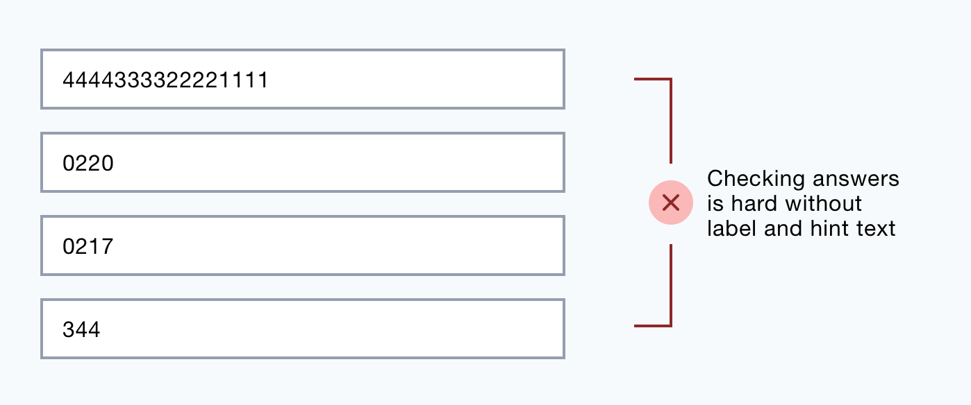
Some users check their answers before submitting them. As the placeholder text is no longer available, it’ll be hard to check their answers against the requirements.
5. Errors are harder to fix
Label and hint text helps users answer the question. An error message without these can make errors harder to fix.
6. Some browsers hide them when the input is focused
Some older browsers hide placeholder text as the input is focused. This means the user has to read ahead of the current field to see the hint.
7. They may be mistaken for an answer
Placeholder text has a lower contrast to signify it’s not user input. But this is subtle which means users can mistake the hint for an actual answer.
Once they submit the form, the user will have to fix an error that wasn’t their fault.
Some users do notice the text but try to select and delete it. This is frustrating as placeholder text cannot be selected.
8. They have low contrast
Placeholder text has low contrast to distinguish it from a user input. But this makes it ineligible for people with visual impairments or if the light causes screen glare.
9. Some screen readers don’t recognise them
Some screen readers don’t acknowledge placeholder text making the form inaccessible to screen reader users.
10. They reduce the the label’s hit area
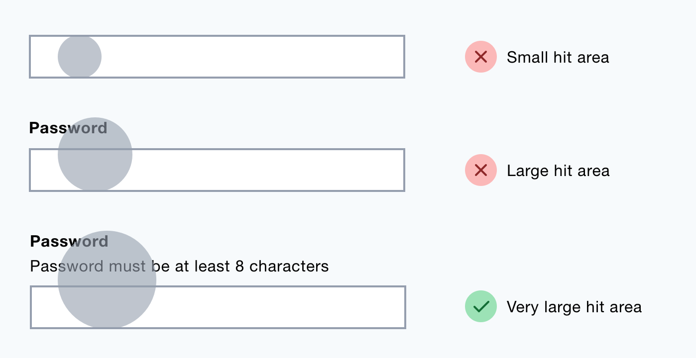
When a label is clicked, its related input is focused. This is useful, especially for users with motor impairments.
The use of placeholder text reduces the hit area of the input.
11. They crop long text
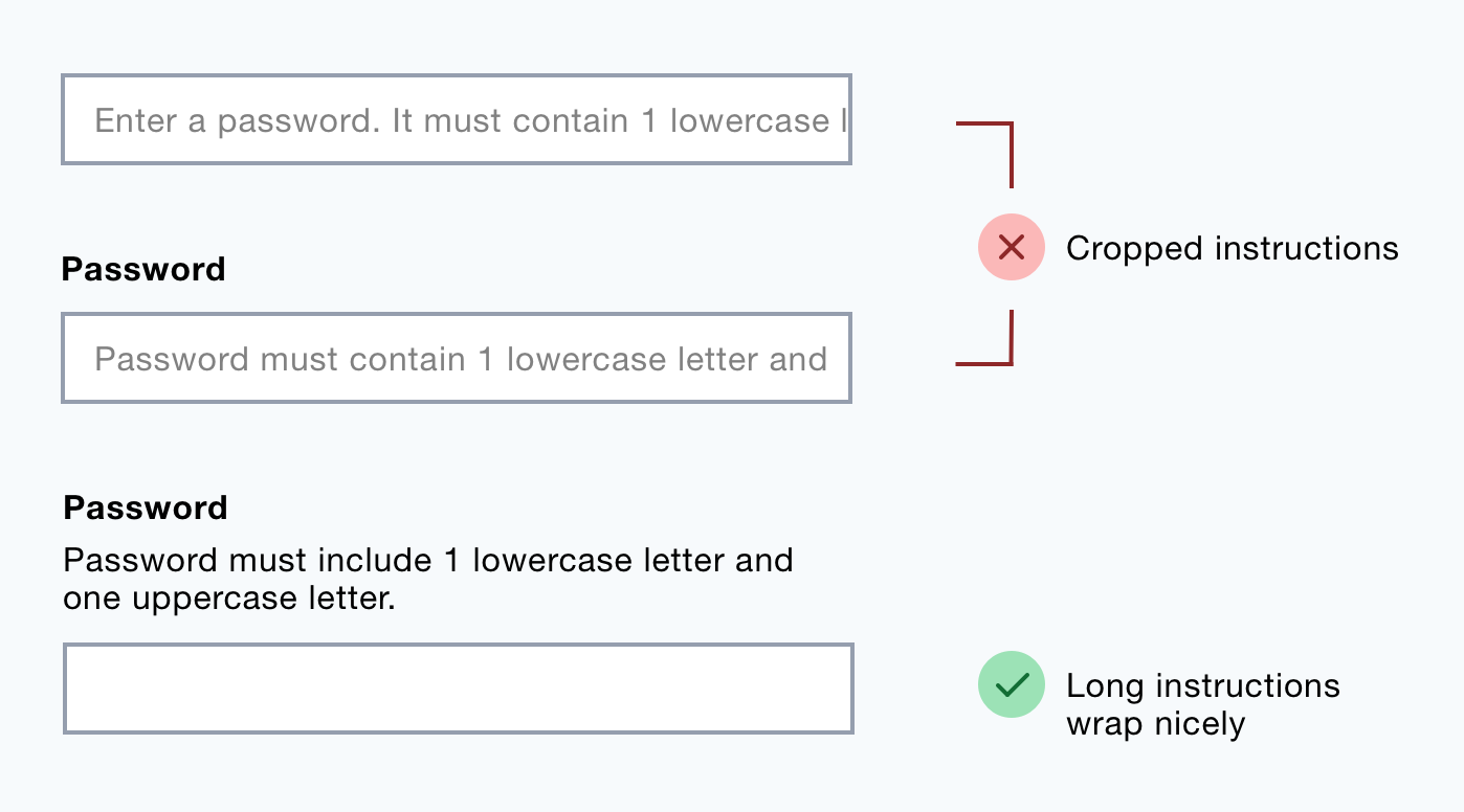
Long placeholder text gets cropped making it inaccessible.
12. Some browsers don’t translate them
Chrome, for example, will fail to translate placeholder text.
13. They don’t work well with autocomplete
The browser’s auto-complete routine populates fields automatically. This means users won’t know what the values relate to which makes it hard to check answers.
14. They look like user input in Window’s High Contrast Modee
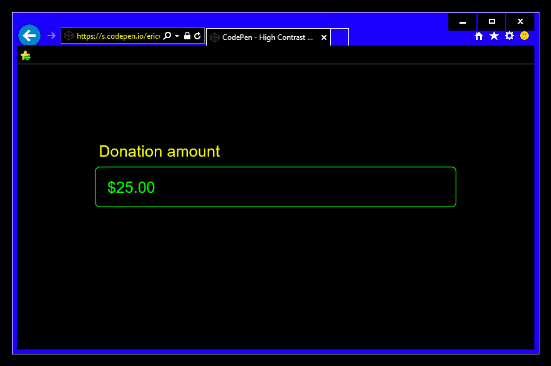
In Window’s High Contrast Mode, placeholder text is given a high contrast color which can be easily mistaken for user input.
Summary
Placeholder text saves space at the cost of usability and accessibility.
Instructional text is crucial content that users need to answer questions correctly and easily.
Putting that text above the input gives users access to the content they need, when they need it no matter the situation.
That’s just good design.