Where to put buttons on forms
There’s been some comments about this on Twitter.
Button placement on forms is often ignored or prioritised based on what looks good.
But button placement can make or break a form, and a form can make or break a user’s experience. That’s why it’s essential to get it right.
This is more challenging that in sounds because it depends on the buttons and the form in question.
It also requires us to analyse different forms holistically. Otherwise we could end up with the same button appearing in different places which is inconsistent and confusing.
Here I’ll explain where to put buttons across a range of different forms based on research and best practice.
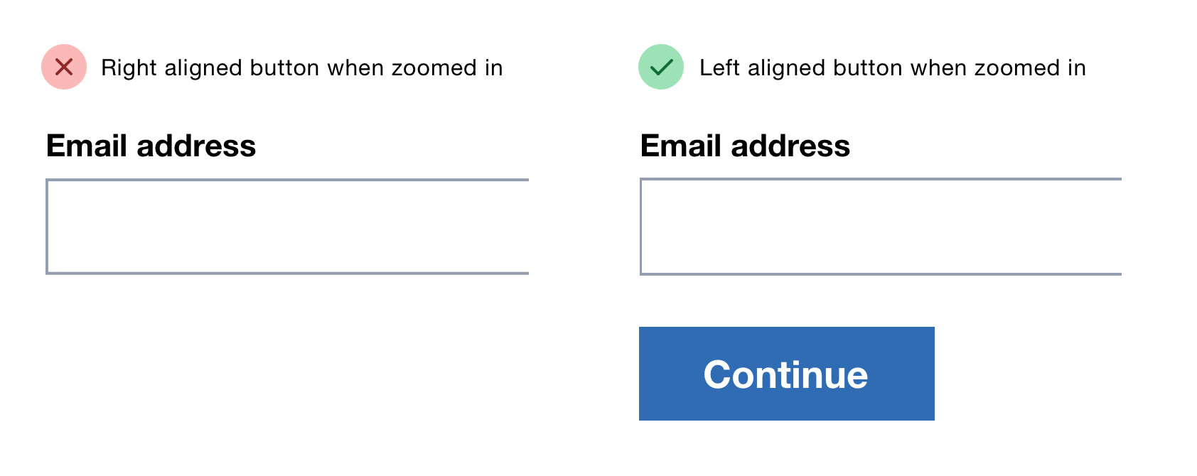
Align the primary button to the left edge of the inputs
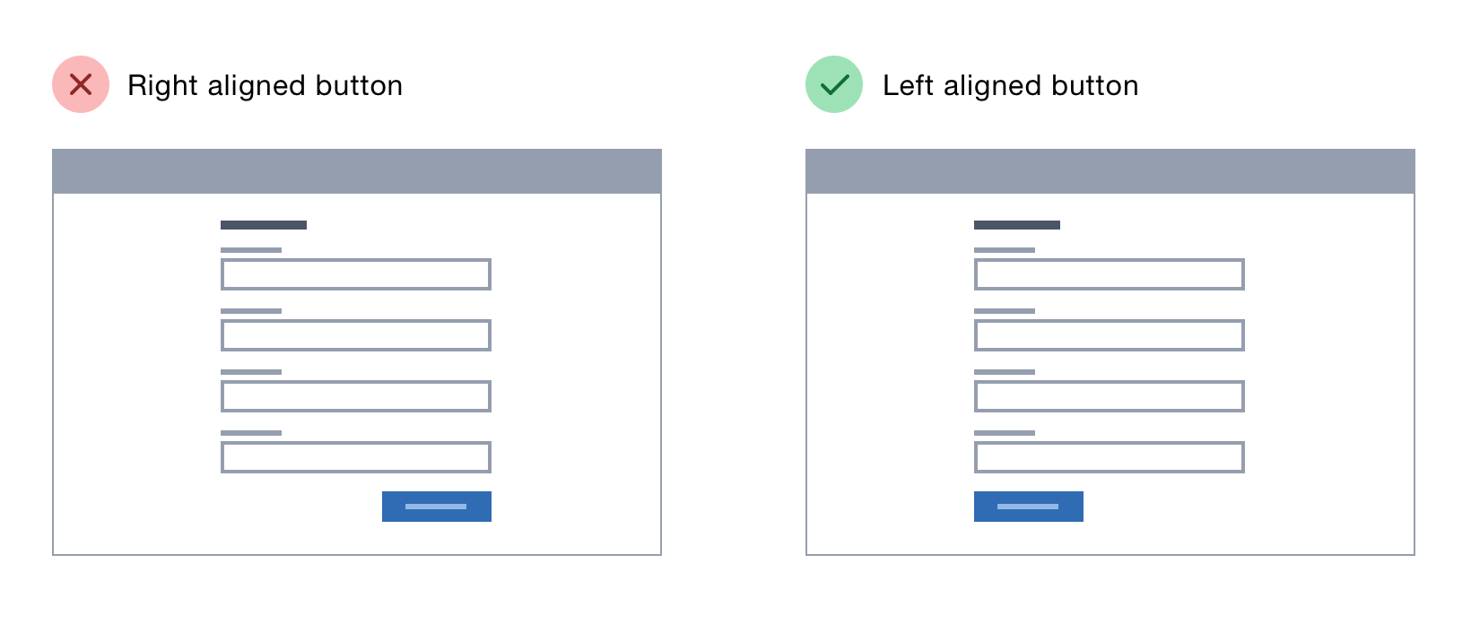
In his article reporting on eye-tracking research, Luke Wroblewski says the primary button should be aligned with the left-hand edge of the input:
“illuminate a clear path to completion. Aligning inputs and actions with a strong vertical axis clearly communicates how to go about completing a form.”
This layout also helps screen magnifier users to see it without having to pan across.
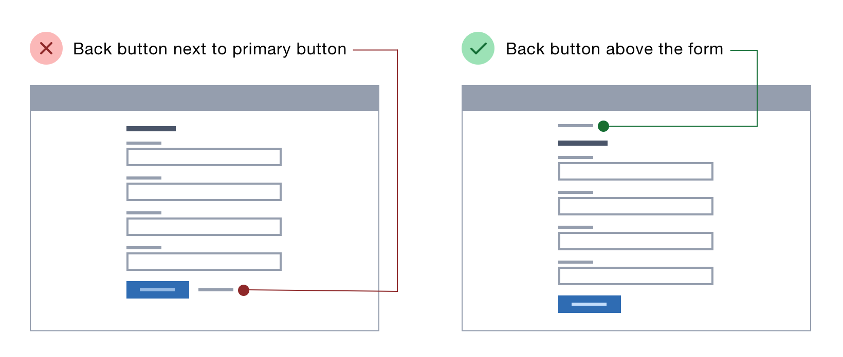
Put the back button above the form
Some forms or questionnaires appear across multiple pages and some people want to go back to check or change their answers.
Unfortunately some users don’t trust the browser back button because of their experiences of poorly designed forms that lose data when they click back. The solution is to provide a form-specific back button.
Research carried out by Mick Couper, Reg Baker and Joanne Mechling shows that placing the back button to the right of the primary button is confusing and it should go either to the left or underneath instead.
Underneath is preferable because it keeps the primary button consistently located and lets keyboard users tab directly to it from the last field.
But their research did not include an option with the back button at the top of the page.
Joe Lanman, a designer at the Government Digital Service, put the back button at the top of the Register To Vote exemplar digital service. It’s now the standard approach for all government services.
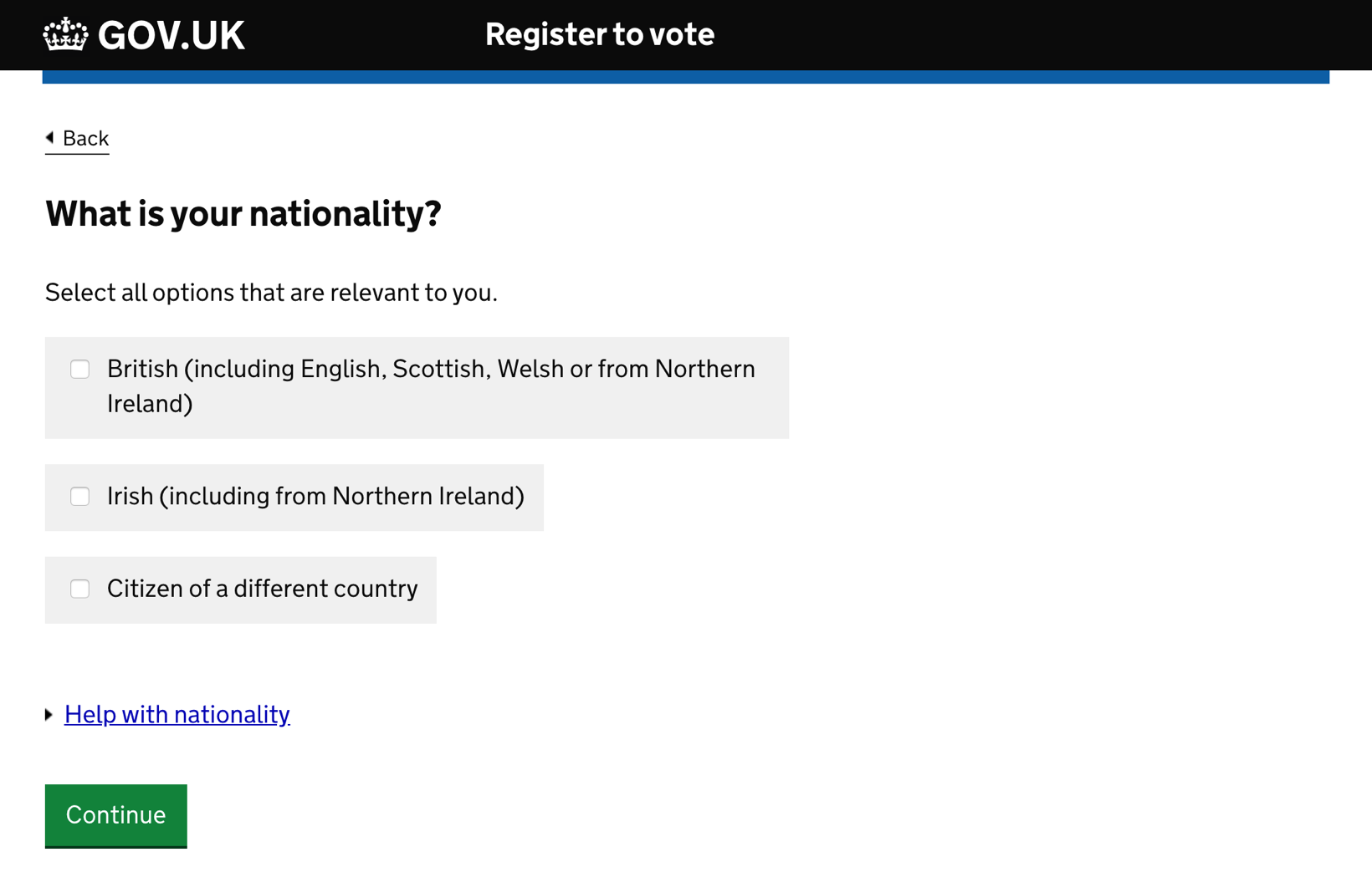
Joe said putting the back button at the top works well because it’s:
- in a similar place to where most browsers put the browser back button
- most likely to be needed soon after the user lands on a page that looks wrong or if the user wants to check what they just entered
- probably not needed once the user fills out the form—if they fill out the form and click back, they will lose their answers
This approach clearly differentiates the back button from the primary button which should decrease the time it takes users to proceed. And it makes room for additional buttons when needed which I’ll cover later.
Put tangentially related actions above the form
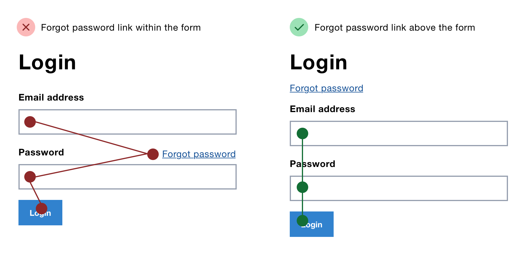
Some forms have actions that don’t submit data and are only tangentially related to the form itself.
For example, a ‘forgot password’ link on a login form lets users reset their password—but it’s not part of the login process itself.
You’ll often see the ‘forgot password’ link next to the password field, but this is problematic because users:
- expect the tab key to focus the next field/button
- might have to scroll to find the link
- might waste time typing in their email address before clicking the link
Putting the link above the form solves all of these problems.
Place extra buttons based on what they do
Forms with multiple buttons are problematic.
The time it takes to make a decision increases with the number and complexity of choices, so extra buttons add extra choice and extra time.
Also, keyboard users can’t be sure which action will be taken when they press the enter key to submit the form.
That said, sometimes having multiple buttons is necessary.
Thinking about what the buttons do makes it easier to decide where to put them.
Let’s look at 3 examples that need different treatment.
1. Put the cancel button below the primary button
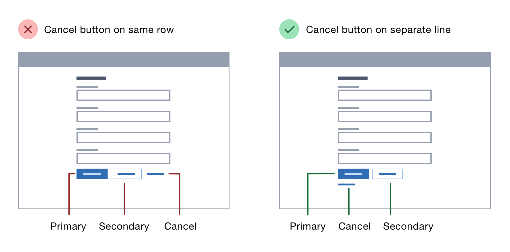
Luke Wroblewski’s research shows the cancel button should be to the right of the primary button and styled less prominently as a link.
But putting the cancel button below the primary button has some advantages:
- Firstly, it conforms to forms expert, Caroline Jarrett’s rule, make it harder to find destructive buttons.
- Secondly, as explained in the back button and additional links sections, the cancel button is not directly related to the form itself so it makes sense to put it below the primary button.
- Lastly, it frees up space for other, directly related buttons to be on the same row. If you put lots of buttons in a row then it’s harder for users to work out which is most important.
2. Put the ‘add another’ button above the primary button
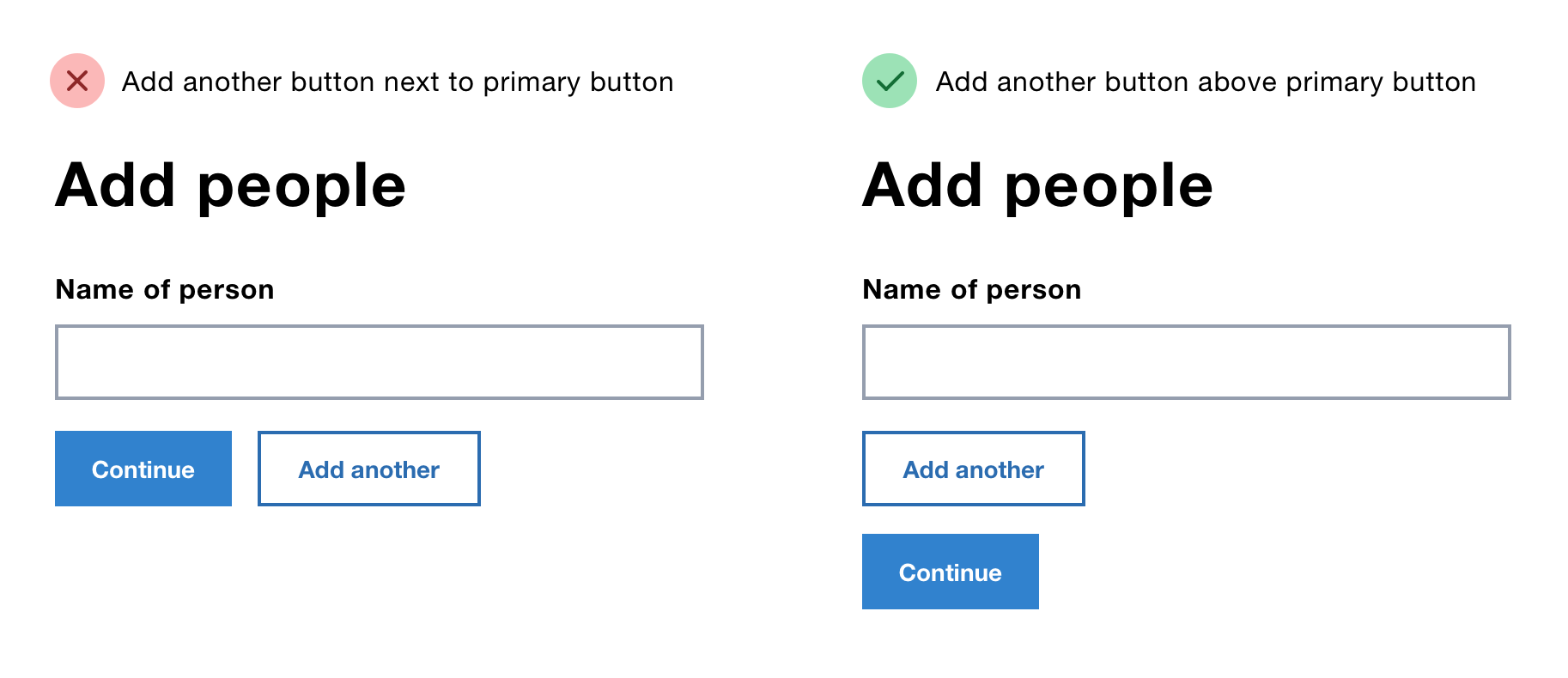
Sometimes users need to add additional information. For example, if they need to add the names of their family members to a booking.
Putting the ‘add another’ button above the primary button has the following benefits:
- users don’t have to go past the primary button to select it, which conforms to Caroline Jarrett’s rule, put buttons in a sensible order
- the primary button stays consistently located on the left hand side as explained earlier
- like Erik Kennedy explains in The 3 Laws of Locality, it’s located where it affects change—next to the field being cloned
3. Put the ‘save and exit’ button next to the primary button
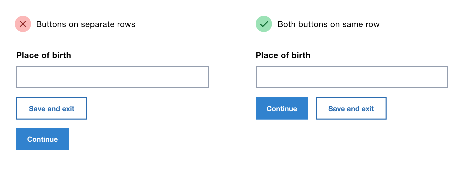
Sometimes users might need to save their progress on a long form.
Putting the ‘save and exit’ button above the primary button implies it’s more important, when it isn’t.
Putting it below can cause an unwieldy list of stacked buttons and uses the area reserved for the cancel button.
That leaves us with putting it next to the primary button which makes sense as the action is directly related to the form.
In some single field forms put the button next to the input
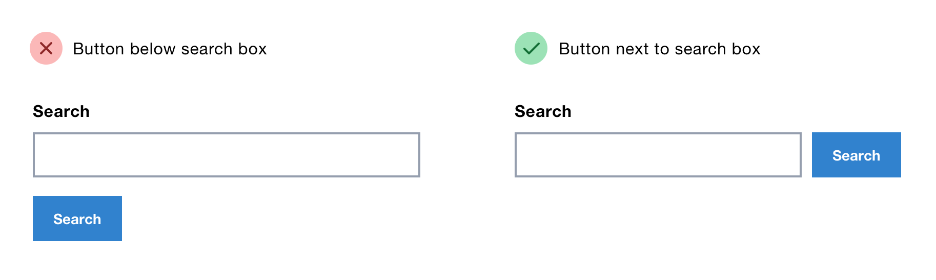
On rare occasions, you can put the button next to the input, which is often seen in global search forms in site headers.
While there’s nothing especially wrong with putting the button below the input, putting it next to it saves space and looks a bit neater.
But do not do this on standard forms that happen to have just 1 field. It’s inconsistent and unconventional.
Put buttons on multi select forms above the form
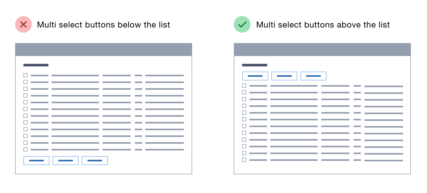
Multi-select forms let users select and action multiple items at once. For example, in Gmail you can select multiple emails and archive them in one go.
In this special case, put the buttons above the form.
This is another example that works because of Erik Kennedy’s rule, if a control affects change across an entire area, put it above that area.
Putting the buttons above the list makes them easier to discover and leaves room at the bottom for pagination controls which are often needed in such interfaces.
Summary
In this article, we’ve looked at where to place buttons across a range of different forms.
Whether it’s 1 button on a standard form or multiple buttons on a multi-select form, button placement is crucial and needs due care and attention.
Checklist
- Align the primary button to the left edge of the inputs
- Put the back button above the form
- Put tangentially related actions above the form
- Place extra buttons based on what they do
- In some single field forms put the button next to the input
- Put buttons on multi select forms above the form
Thanks to Caroline Jarrett for helping me write this.