Why Anthony Hobday’s sentence-style form is bad UX (and what to do instead)
Anthony asked me to tell him why his sentence-style form is awful.
In case you didn’t know:
I love attacking bad UX.
So when I got Anthony’s message, I dashed to the computer to tap out a quick response (which I’ll share in a sec).
But I want to point out that most sentence-style forms (also known as natural language forms) are a lot more complicated than Anthony’s. They usually have multiple fields, longer sentences and other issues that Anthony’s design doesn’t have.
But his design still has plenty of issues, some of which are rarely found in other sentence-style forms.
I’ll also tell you what I’d do instead (the most boring, simple, obvious, uncontentious thing that gets you zero cool points but actually gives users the best UX).
Here goes:
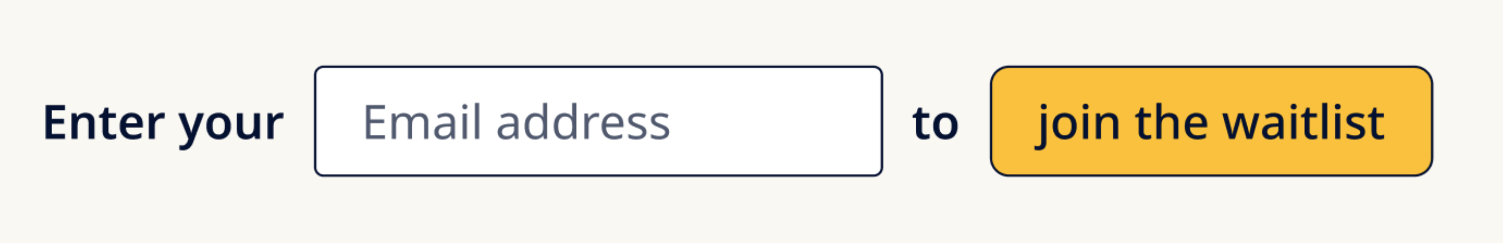
Issue #1: There’s more for users to read
The words “Enter your” and “to” don’t add value.
This makes users work harder than they have to.
Issue #2: The button label looks like a mistake
Because the form only has one input it has to include the button to make it work as a sentence.
But this is unconventional, looks a bit like a mistake and is inconsistent with regular button text.
Issue #3: There’s no space to show an error inline
This is because the sentence layout means that showing an error would break the layout.
But good design accommodates different states.
Issue #4: Translation can break the layout
Some other languages have longer words which will break the layout.
But good design works for all languages.
Issue #5: It’ll break on mobile
This is because the button will wrap onto another line.
But good design works on all screen sizes.
Issue #6: It uses placeholder text
Placeholder text is a whole thing of it’s own but as a quick summary:
- it may get cropped
- it may be mistaken for an answer
- it’s harder to read
Good design is the opposite of all 3.
Issue #7: It doesn’t look like a real form
While this doesn’t apply so much to Anthony’s design I wanted to mention this because most sentence-style forms don’t look like forms at all.
But forms should look like forms so users can recognise them as such without having to think.
There are many form design challenges that are complicated and need due care and attention…
But sentence-style forms aren’t one of them.
Just lay out the form normally with a:
- Label
- Input
- Button
Then get back to solving real UX problems instead.
If you’d like to do just that, you might like my course, Form Design Mastery: