Redesigning Just Eat's checkout and search results page
Background
Just Eat is the world’s leading digital takeaway delivery service. They’re based in 13 countries with over 60,000 restaurants and more than 15 million customers.
During Just Eat’s rapid growth, they created a mobile-specific site which was inconsistent with desktop.
We needed to imrove order completion rates while creating a consistent and responsive site in-keeping with the impending brand refresh.
Process
We watched users make real order in our research lab as well in their own homes. And we ran bi-weekly A/B tests using Optimizely. We used the the results of this research to prioritise our work.
We usually started with sketching ideas out roughly on paper. Then we moved to higher fidelity prototypes in Sketch, Invision and HTML.
We had internal design crits and iterated until there were no major issues.
Redesigning the checkout flow
The existing single page checkout flow used accordion panels for each step. The team before us had believed that fewer clicks resulted in a better order completion rate.
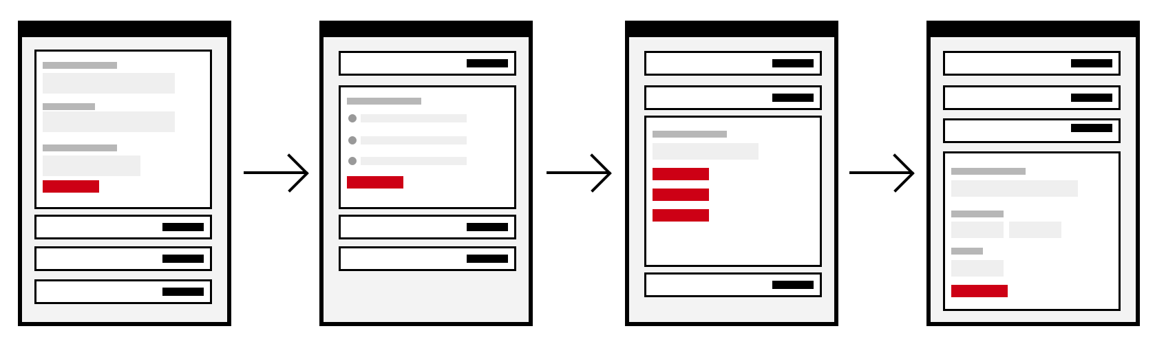
But our research showed that users got stuck and spent time scrolling up and down the page to open and close panels.
And some interactions were inconsistent with each other. For example, the delivery page had multiple buttons but the other pages used radio buttons and a single button.
We put each step on a page of its own with each page working consistently with just one button per page.
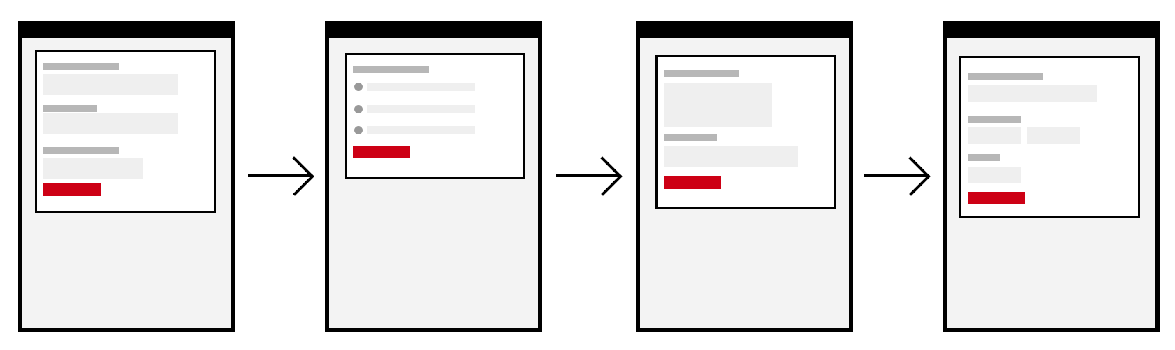
Our research showed that users found this a lot easier and increased order completition rate by 5%.
I wrote an article for Smashing Magazine on the benefits of using One Thing Per Page.
Redesigning the search results page
The mobile version of the search results page was inconsistent with desktop. For example, mobile had no filters.
And we noticed the sort component used a select box without a submit button which is problematic.
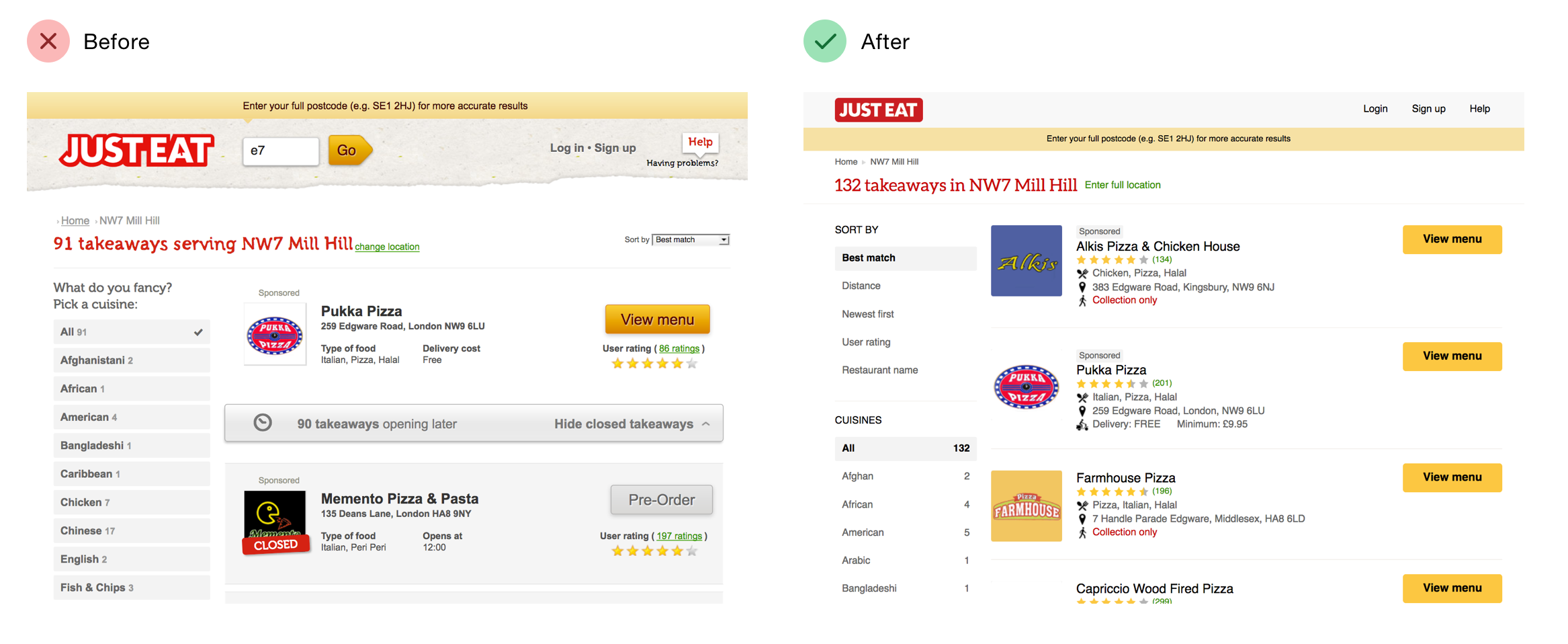
But we didn’t want to just add a button, because we were concerned users might have come to expect it to work without a separate click.
So we designed an accessible and responsive sort component that worked consistently on small and large screens.
On mobile, the options start collapsed to make space for the search results.
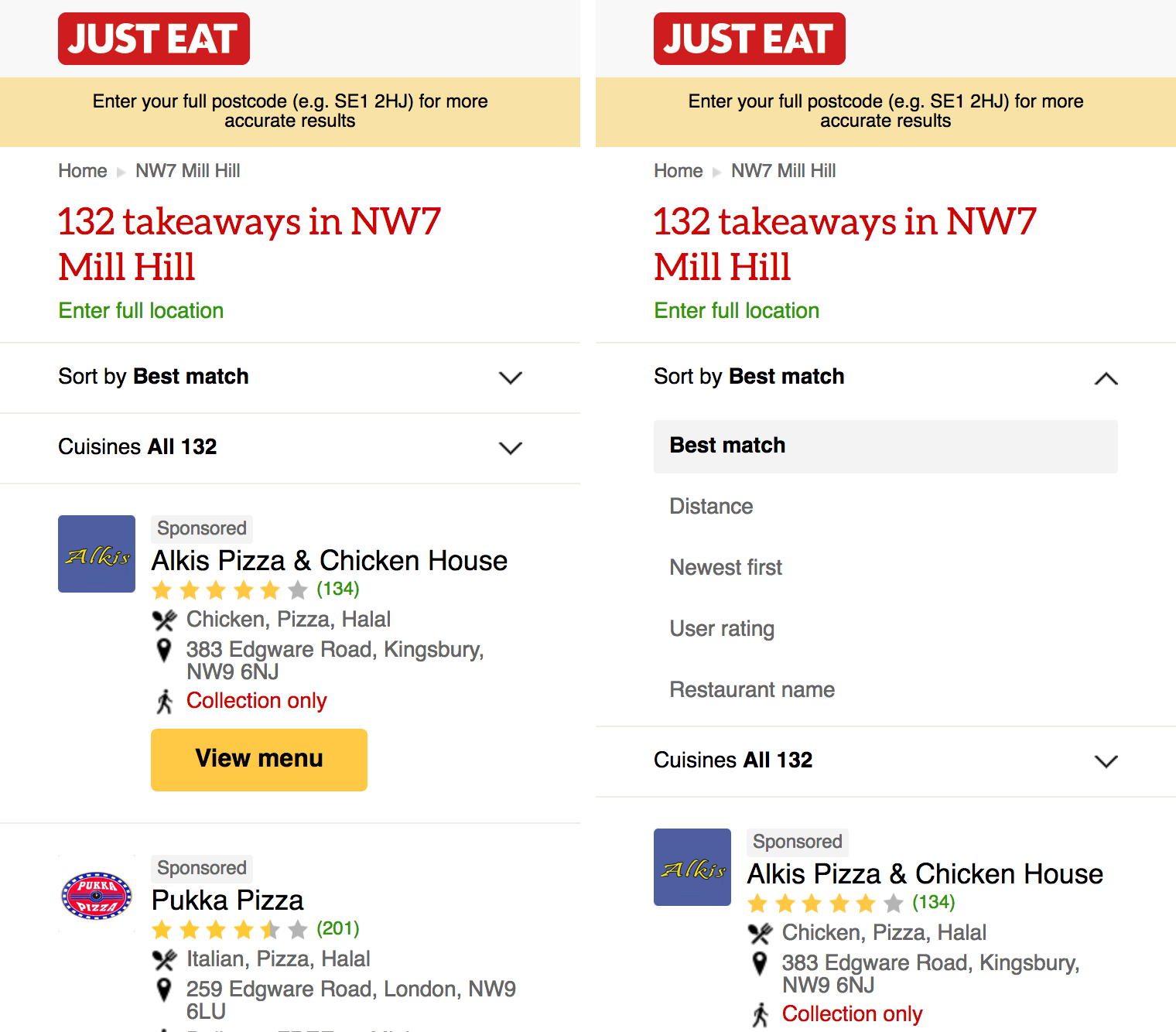
This work increased order completion rate by 3%.
Adam’s positive and pragmatic approach to solving problems shows through his strength of knowledge in building cross-browser, accessible and progressively enhanced interfaces used by millions.
Mark Jenkins, Lead Designer