4 common mistakes UI/UX designers make when trying to help users spot required form fields (and what user research shows is better)
“Just whack a red asterisk next to each field and call it a day.”
Back in 2008 I worked for a software house. We specialised in e-commerce sites for big organisations like Boots, Argos and Homebase.
They had the usual forms.
Registration, forgot password, sign in and checkout. We whacked little red asterisks next to each required field; added some text to the top to explain what it means; and called it a day.
But we never tested it.
We never even really thought about it.
We just followed what everyone else did.
Fast forward 15 years and the same thing happens today. Which is a shame as these little asterisks (and other techniques used to denote required) fields can be a real problem.
Seeing as I get asked about this topic, I thought I’d cover it off so you can focus on more important problems.
As usual, I’ll start with what doesn’t work before revealing what does.
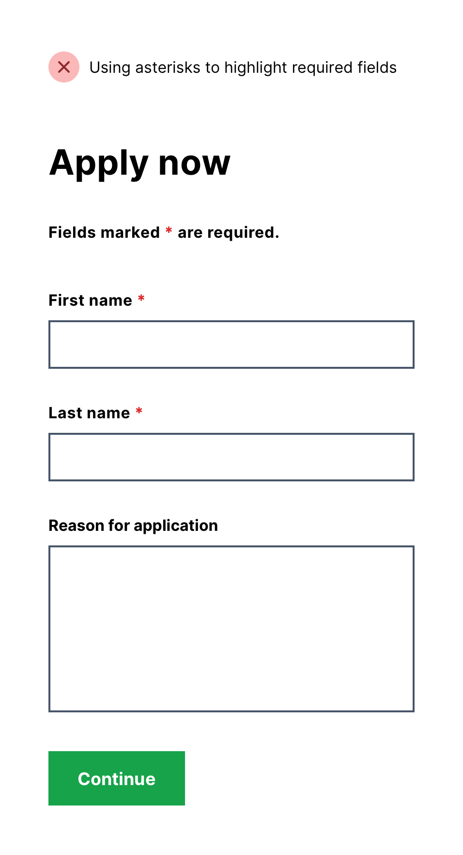
Mistake #1: Using an asterisk to highlight required fields
This is because many users don’t notice the asterisk or understand what it means.
Good design doesn’t make users think.
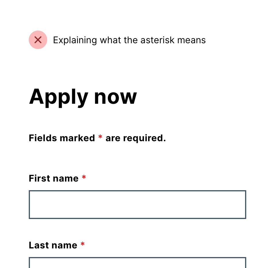
Mistake #2: Explaining that required fields are marked with an asterisk
This is because most users don’t read instructions especially if they don’t relate to a question.
Good design doesn’t need to be explained.
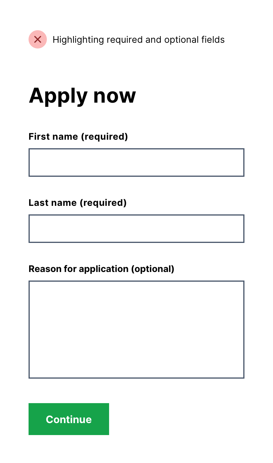
Mistake #3: Highlighting both required and optional fields
This is because highlighting both fields increases visual noise and slows users down.
Drawing attention to everything means drawing attention to nothing.
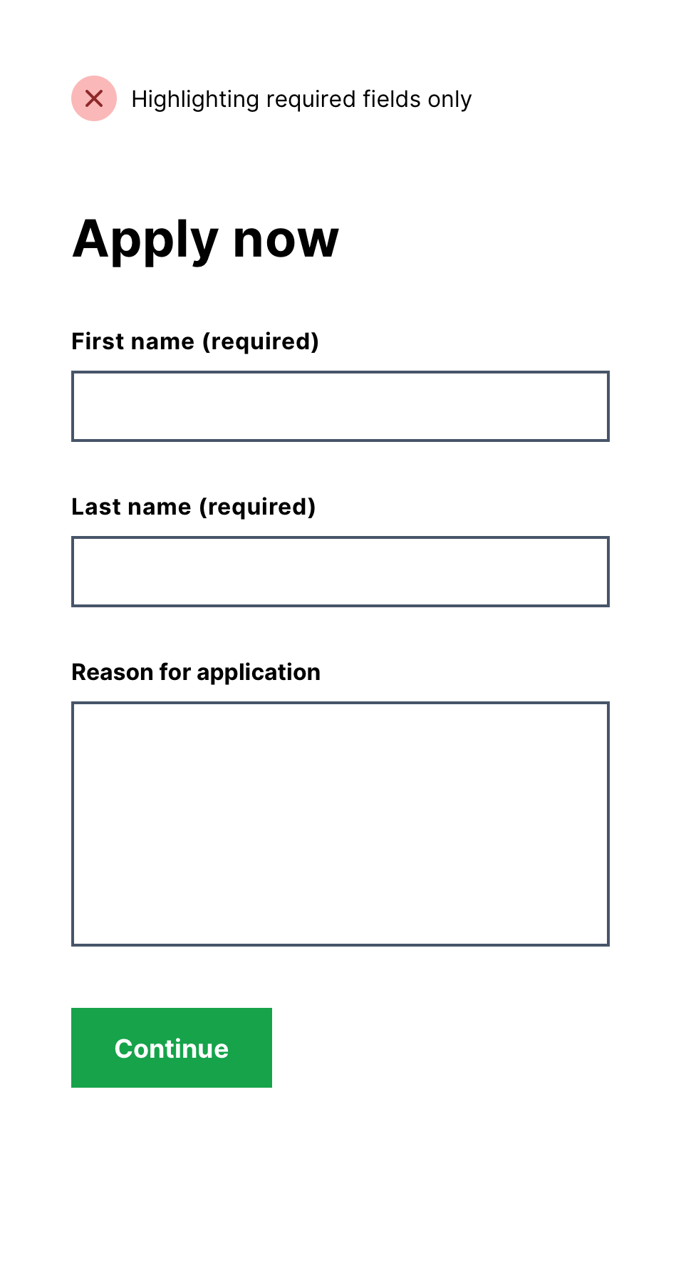
Mistake #4: Highlighting required form fields only
This is becaue most users assume all fields are required by default (and rightly so) so it’s unnecessary to draw attention to them.
Good design doesn’t do more than it needs to.
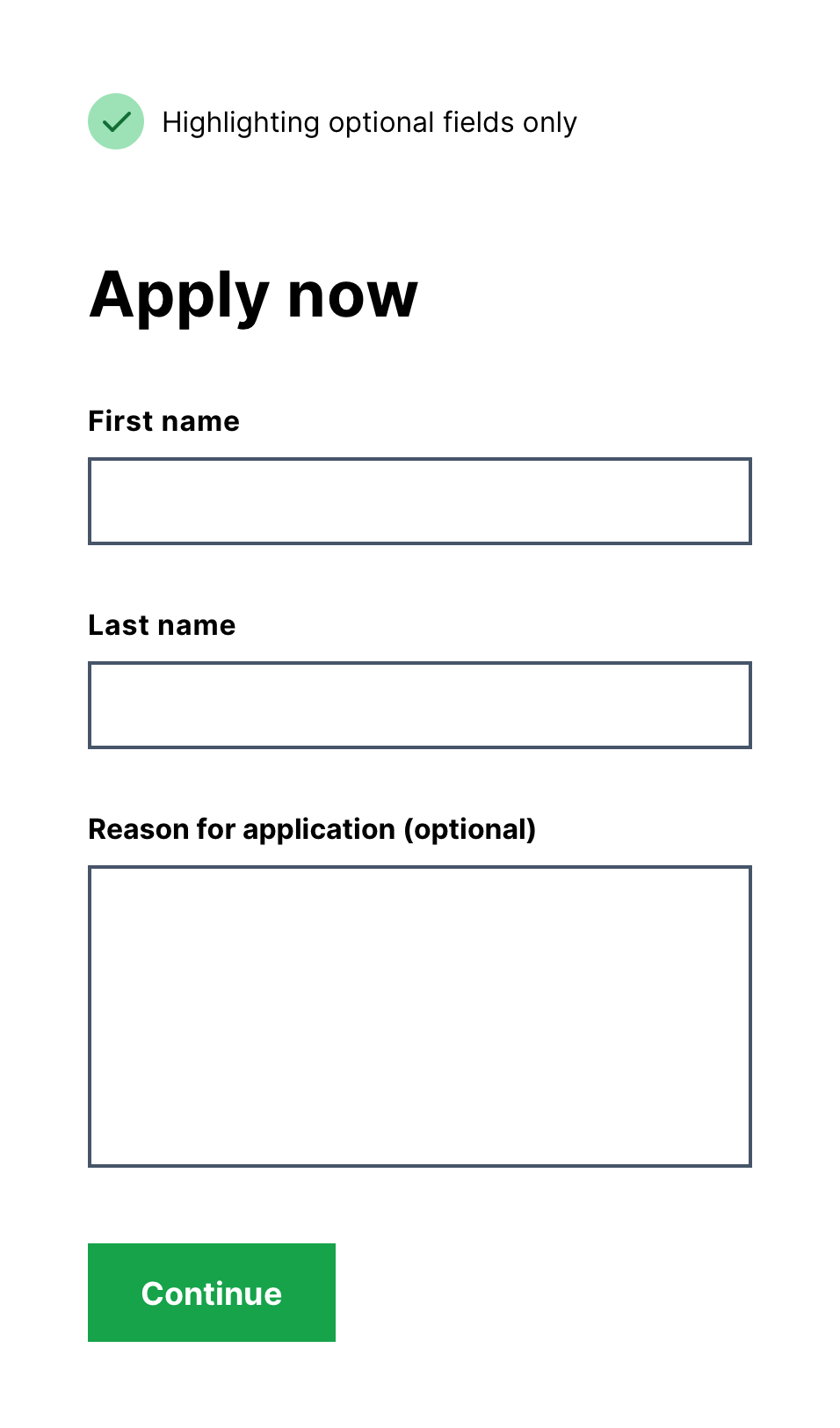
Only highlight optional fields
Well designed forms usually avoid optional fields (one way is with branching questions).
This means optional fields should be rare. Given the point of highlighting is to draw attention to what’s different, it’s better to mark optional fields.
To do that add “(optional)” to the label.
Minimal noise, maximum clarity.